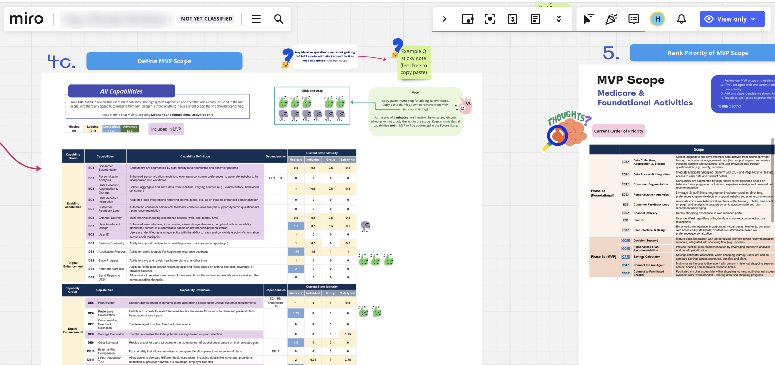
The team attempted to work with the client to quantify loosely defined requirements in order to decide on the MVP scope.
To overcome this, I first leaned on internal subject matter experts to help interpret the requirements and gain their perspective on what's crucial for the user. I then prioritized high-impact moments, such as the Plan Comparison screen, to focus my efforts on reimagining the experience. For other screens, I utilized standard design patterns in the industry with slight UX improvements to save time. In workshops, I made sure to articulate my design rationale, backing it with real-world references whenever possible, and highlighted how feedback was addressed. The client was very receptive to this approach, delighted by some unexpected features and trusted the design choices, which reduced the number of iteration requests

Collaborating with team and client on a Miro board. Clear explanations of screen interactions and real-world references are shown. Additional voice-over explanations on design rationales are included during workshops. MVP features are also mapped on the board to illustrate how requirements are reflected in the UI.
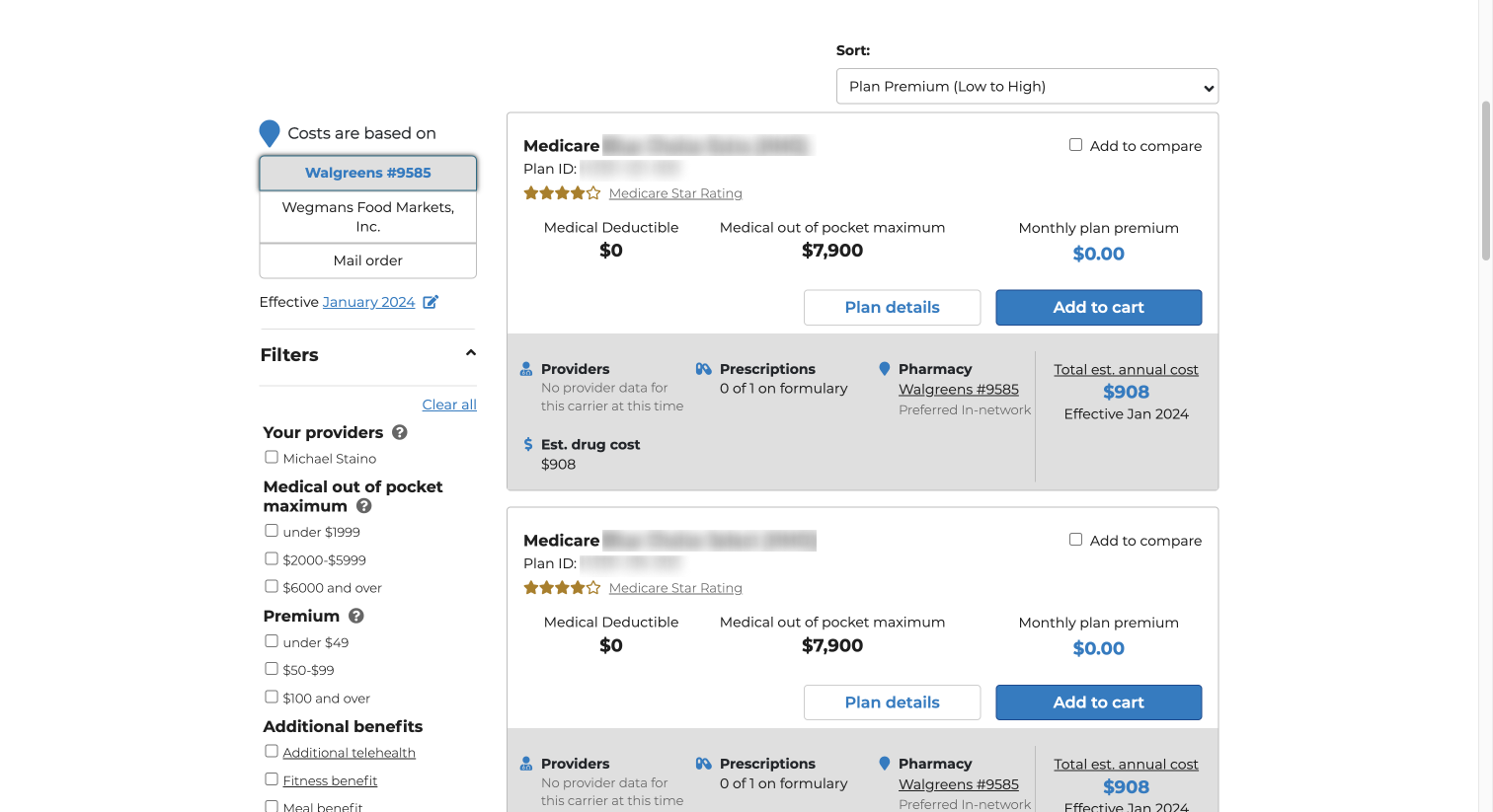
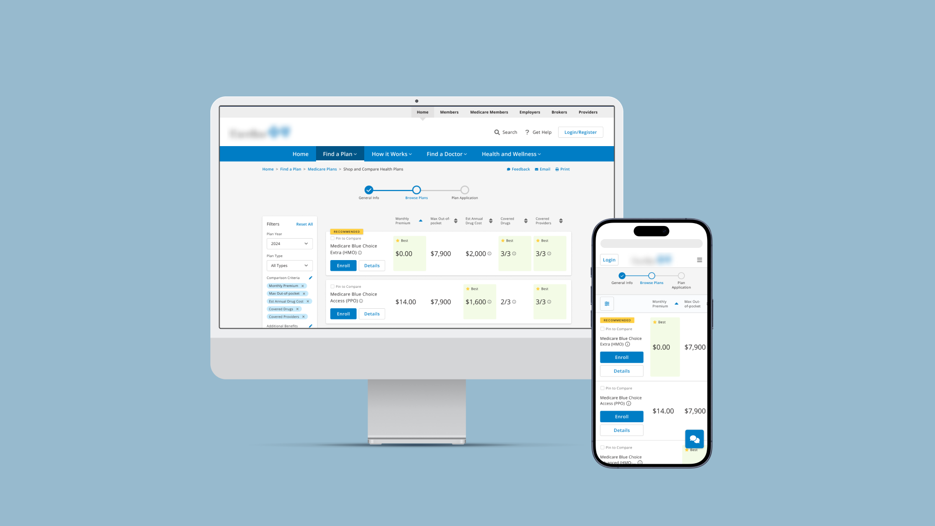
The current state overwhelms users with an excessive amount of information without considering relevance. The layout makes it difficult for users to visually compare plan features, requiring them to scroll up and down while trying to remember metrics for each plan.

The future state allows users to customize displayed plan features based on their preferences. A more compact, structured layout with visual cues helps users easily compare multiple plans at once.
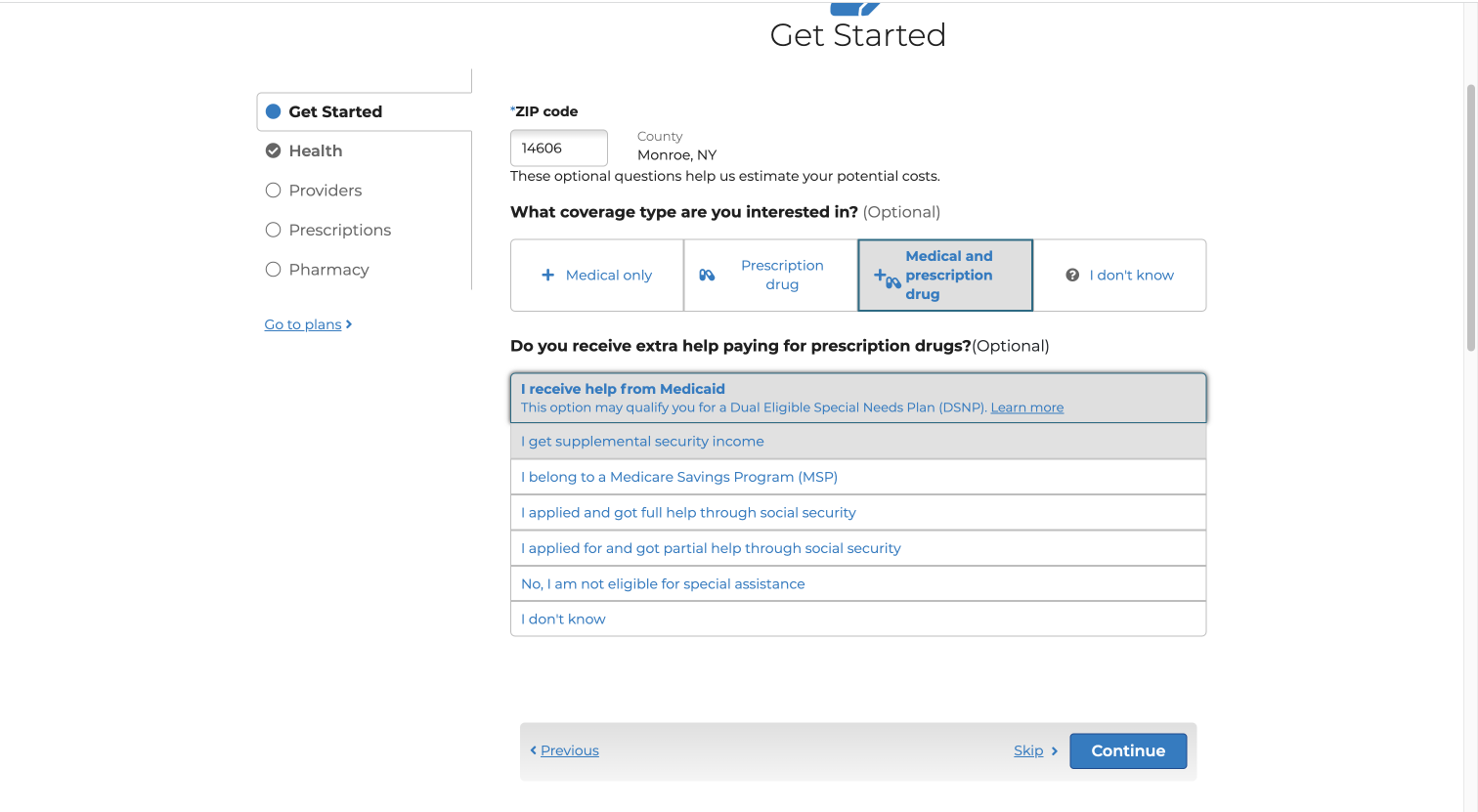
The current state asks an overwhelming amount of questions, which users may not understand due to lack of industry knowledge. The UI fails to indicate where the user is in the overall plan shopping process and how to navigate to view the plans.
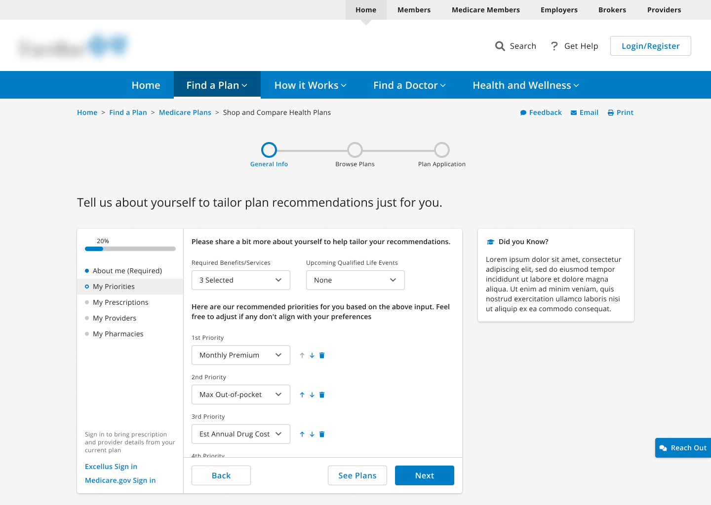
The future state begins with user needs as a starting point and searches for fitting plans. The screen also offers tailored tips to help users understand key considerations at each step. A standard wizard UI pattern is implemented to reduce the learning curve and orient the user on their progress within the overall flow.
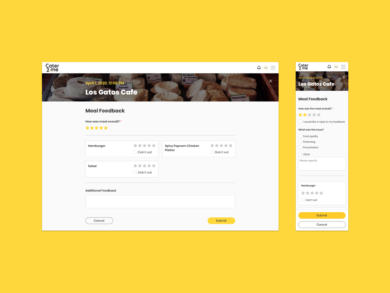
Plan questionnaire screen mockups

Plan comparison screen mockups