Overview
Cater2.me's core service traditionally was managing family-style corporate meal programs and events through our web platform. In 2019, the company started looking at offering additional services where meal participants would be able to order individualized items to diversify our business. This was initially in anticipation of a possible economic downturn. It has since been accelerated by the COVID-19 pandemic, culminating in the launch of a new client portal in April 2020.
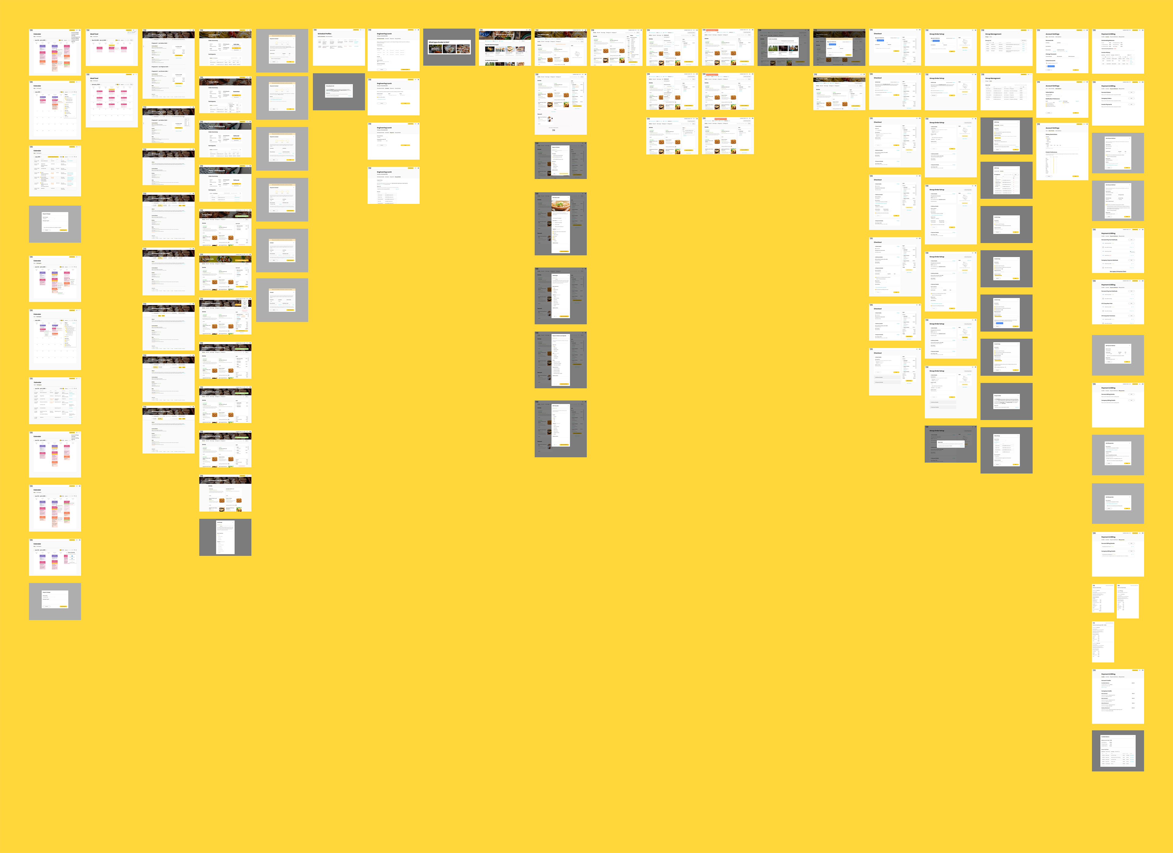
Beginning in August 2019, I participated in an 8-month long project to overhaul our client portal in order to incorporate the new services and revamp core flows to encourage user engagement. As the sole product designer, I worked closely with company founders, department directors, and many other stakeholders to crystallize our visions of the product into actionable designs.
Beginning in August 2019, I participated in an 8-month long project to overhaul our client portal in order to incorporate the new services and revamp core flows to encourage user engagement. As the sole product designer, I worked closely with company founders, department directors, and many other stakeholders to crystallize our visions of the product into actionable designs.
Goals
The project was initially limited to expanding our existing portal which was most used by manager users. A founder then saw the potential to grow usage among employees, which we had long sought after, through a redesign placing new features at the core of the experience.
Thus we ended up with three overarching goals:
1. Develop a new portal providing the ability to place and manage individualized orders on our system.
Thus we ended up with three overarching goals:
1. Develop a new portal providing the ability to place and manage individualized orders on our system.
2. Provide employee users with a more compelling experience to incentivize engagement.
3. Incorporate all functions from our existing portal into the redesign to ensure a smooth user transition.
Challenges
As Cater2.me was primarily a B2B business, the product team did not have direct access to our end users. User feedback had to go through a point of contact at the client and a sales/support personnel before reaching us.
As a workaround, we conducted user interviews and tests with our sales/support personnel, who were closest to the pulse of the user. We also encouraged them to ask questions about user behaviors when speaking with a client and pass along direct quotes when possible.
Another major challenge was the COVID-19 pandemic. Initially, we imagined our new service would be used by existing users in our corporate meal programs. The pandemic completely shifted the business landscape to mostly residential, one-off orders. As a result, we had to rework our user personas and look more to competitors in that space, such as Seamless, to guide our product.
The pandemic also accelerated our timetable for launching the MVP. It greatly elevated the importance of the new service as the family-style model was suddenly completely nonviable. At the same time, there was an urgency to quickly deploy an MVP, so we would be ready to adapt to a new post-pandemic normal for corporate clients while competitors appeared to have been caught unprepared. Thus our launch date was moved up from a mid-year target to April 2020.
To summarize, we encountered several challenges throughout the process:
1. As a B2B business, it was difficult to gain access to our end-users directly.
1. As a B2B business, it was difficult to gain access to our end-users directly.
2. The pandemic greatly altered the business landscape and our target users.
3. The pandemic accelerated our timetable for launching the MVP.
Design Journey
Incorporating Individualized Ordering
Our first step was to define target users and business requirements. I conducted a number of interviews with stakeholders ranging from department directors to sales and support personnel to gain insights into these matters.
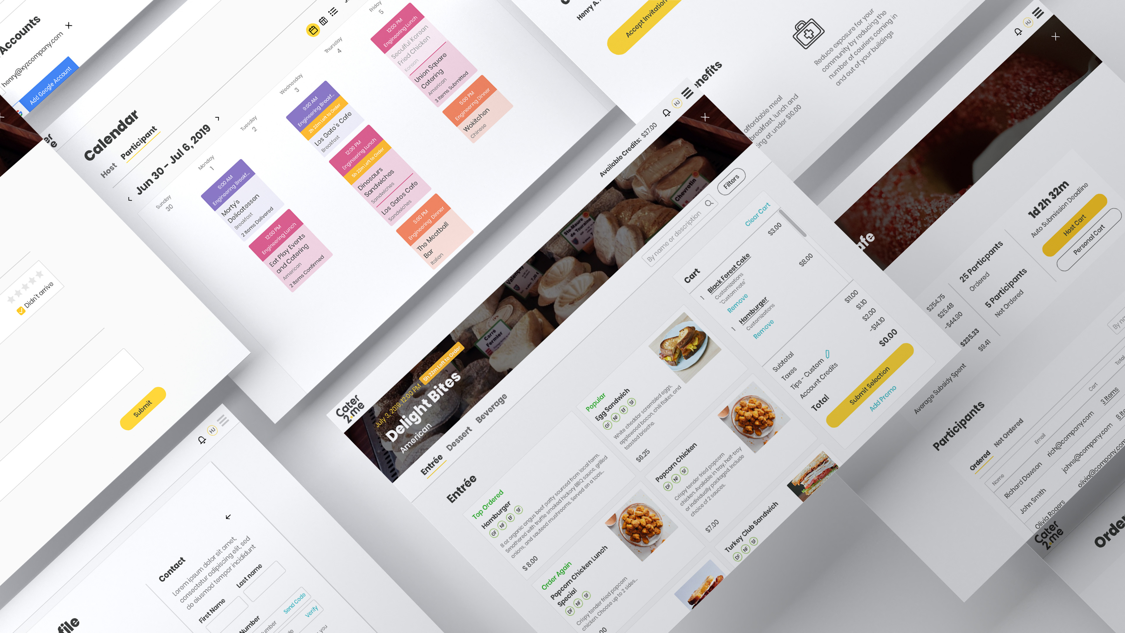
In initial drafts, I proposed only two new additions to our information architecture, "Orders" and "Create Order". The "Orders" section helped managers oversee the status of family-style meal plans and the new individualized orders. The "Create Order" section focused on vendor and meal item selection for individualized orders.
Other proposed changes included reworking the "Calendar" and "User Management" pages. We needed to surface one-off orders alongside recurring meals on the calendar. And managers needed the ability to organize employee groups used in defining access permission to individualized orders.
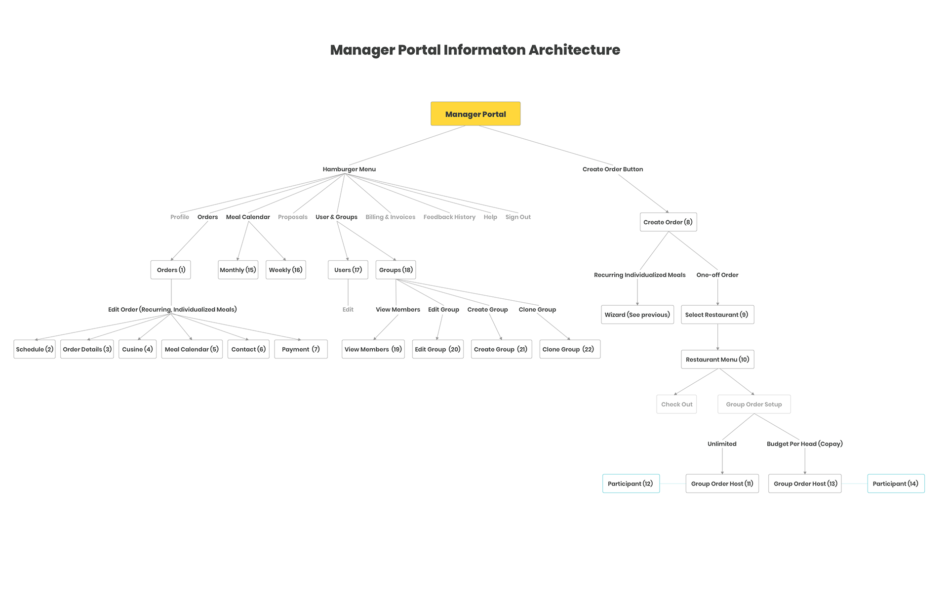
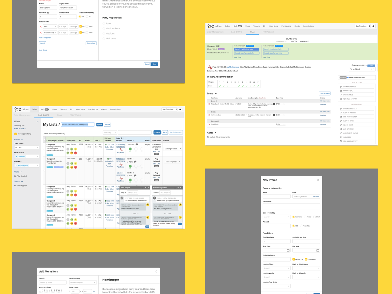
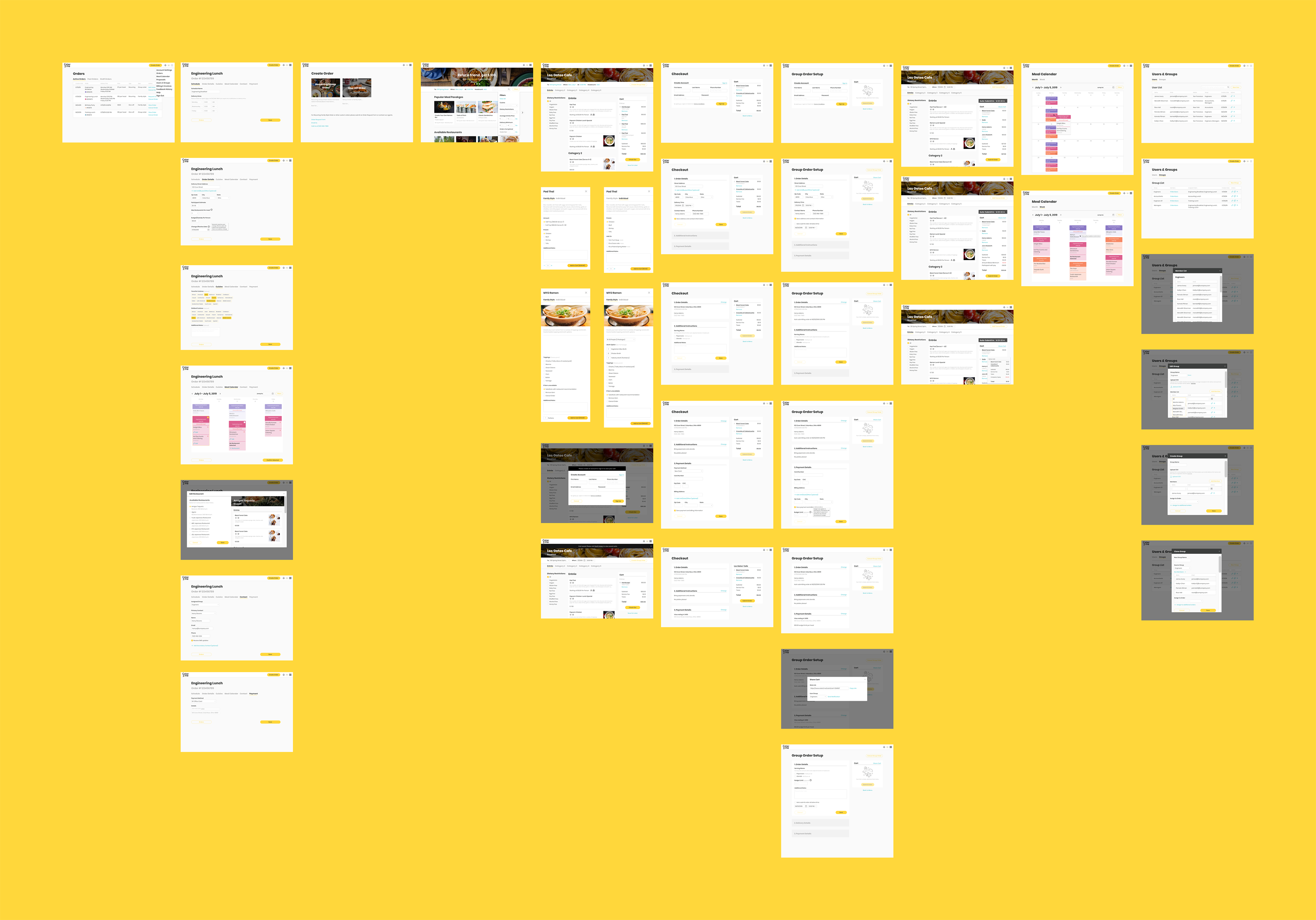
Early draft of site information architecture
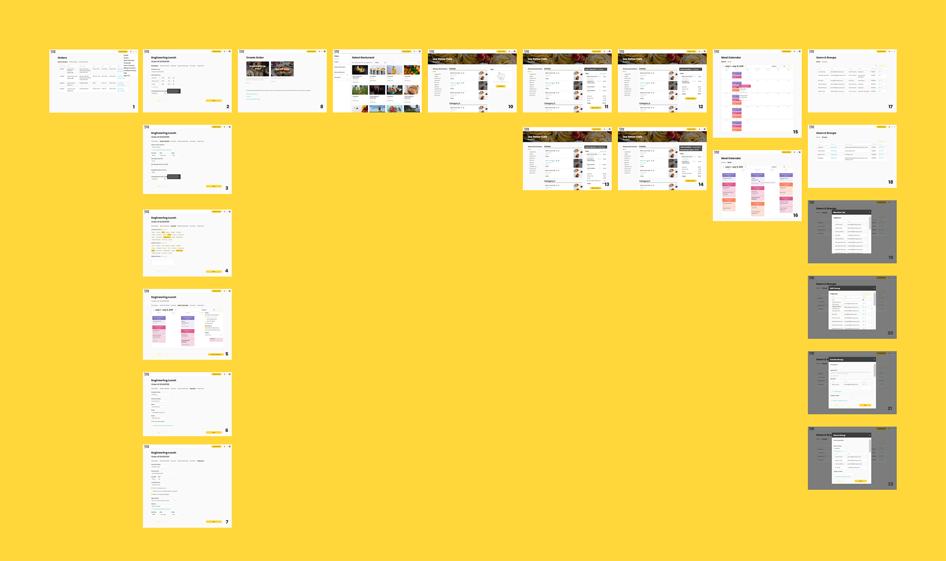
Early screen designs focused on order overview and ordering flow
Fleshing Out Relevant Features
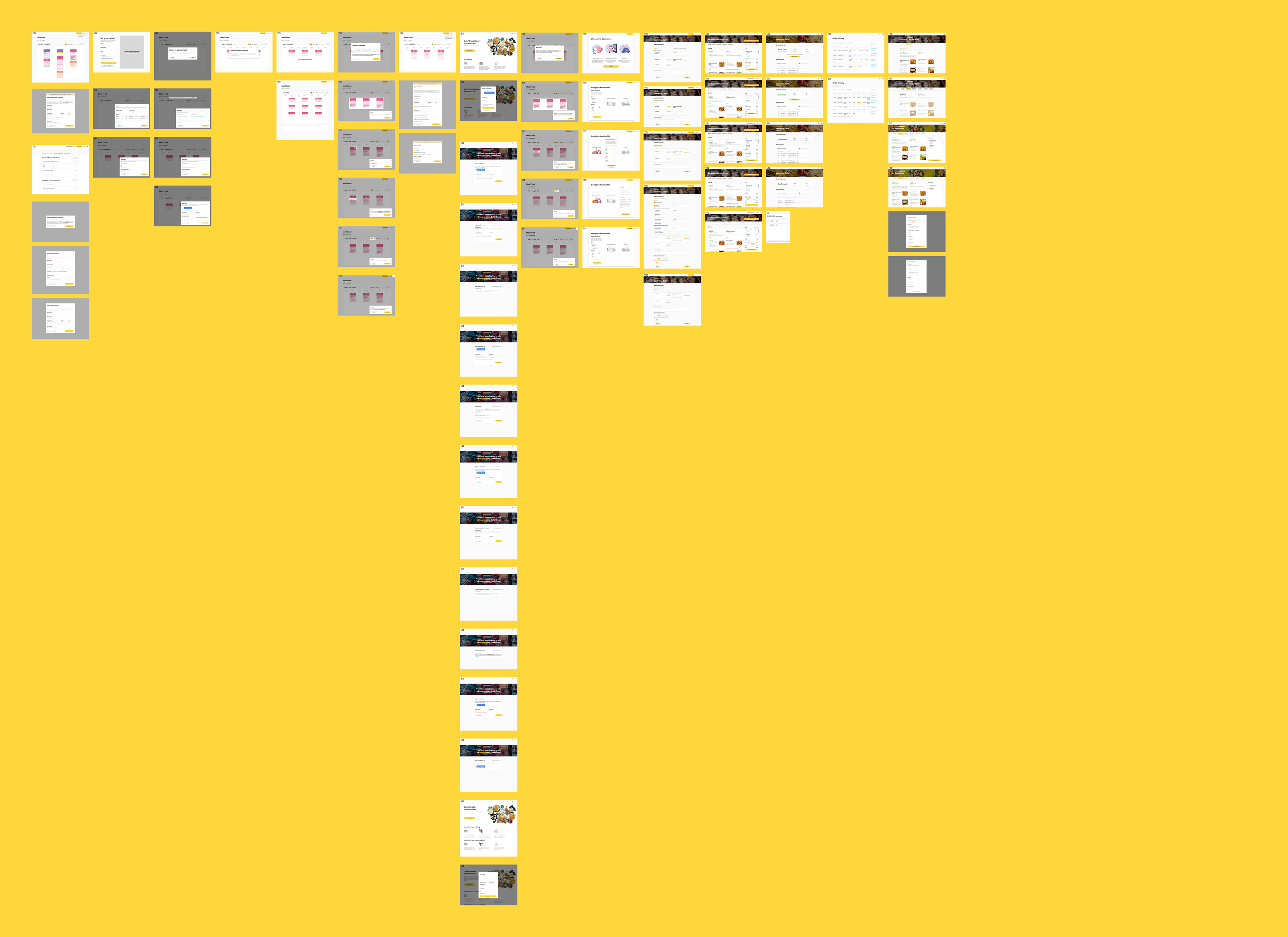
The project next proceeded with a series of rapid iterations to refine flows and fill in gaps. The ordering and checkout flow was fleshed out based on similar services such as Seamless to reduce the user learning curve. Self-service functions for managing order parameters of both types of orders were added as stakeholders sought to minimize help request volume. Lastly, mobile layouts were created because data indicated a sizable portion of users preferred to visit through mobile devices.
Fleshing out order profile, item selection, and checkout flow
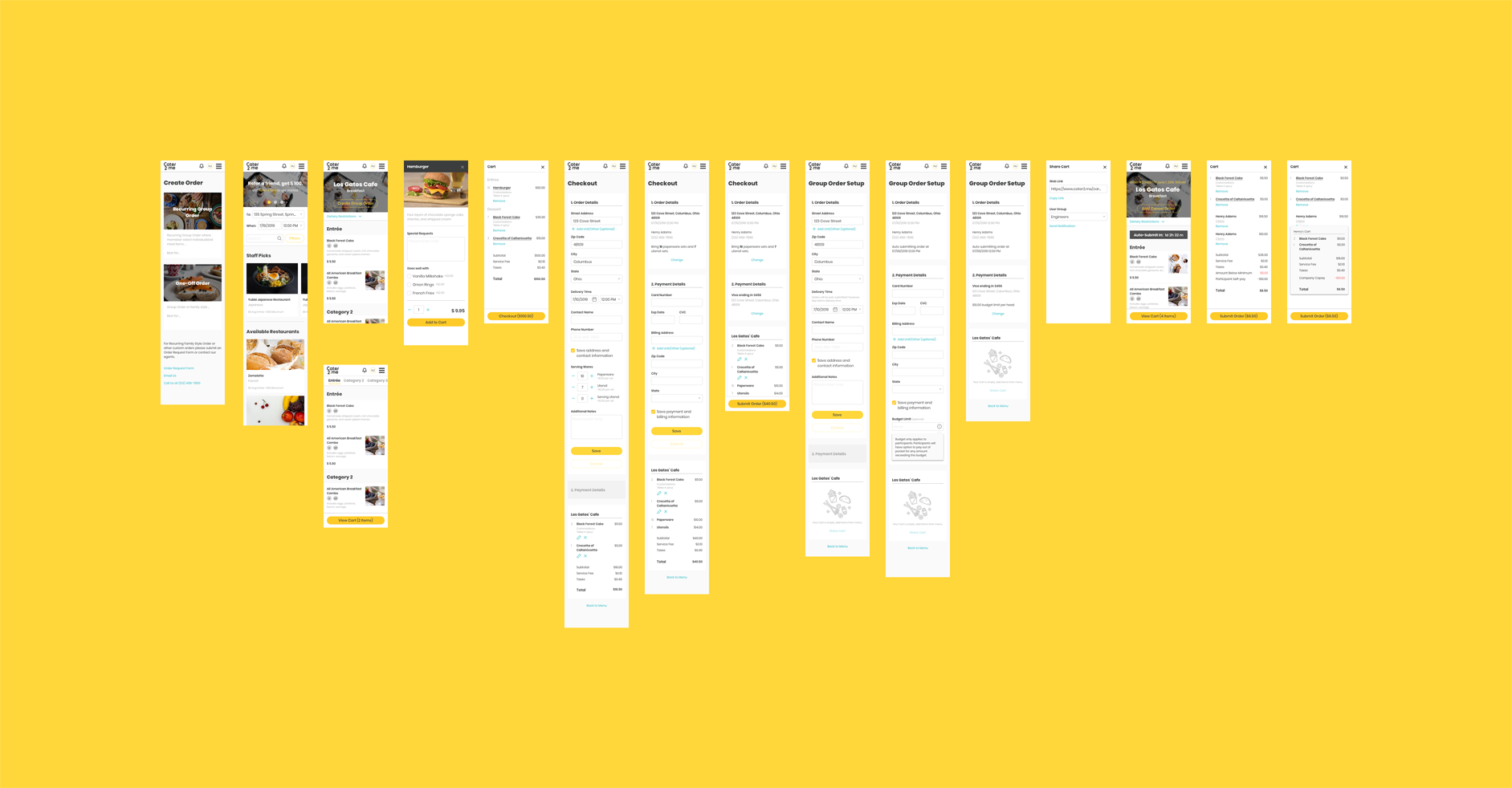
Draft designs for mobile views
At the end of these iterations, an interactive prototype of the project was created on Invision and a number of usability tests were conducted with sales and support personnel. No blockers were discovered and recorded pain points were discussed with stakeholders to brainstorm solutions.
Managing Stakeholder Contention
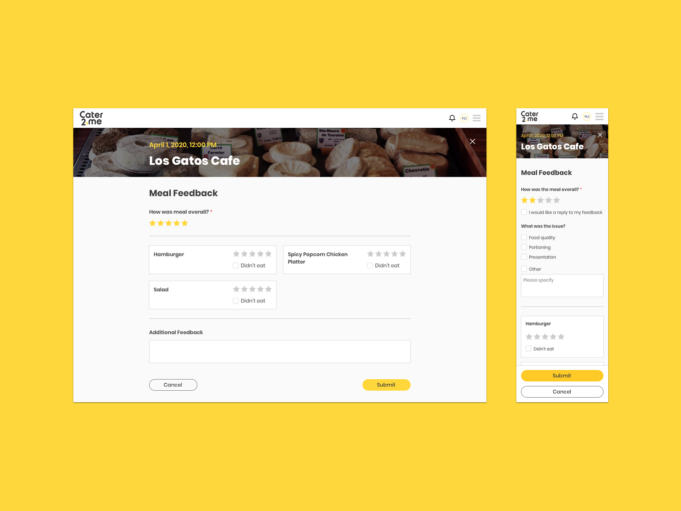
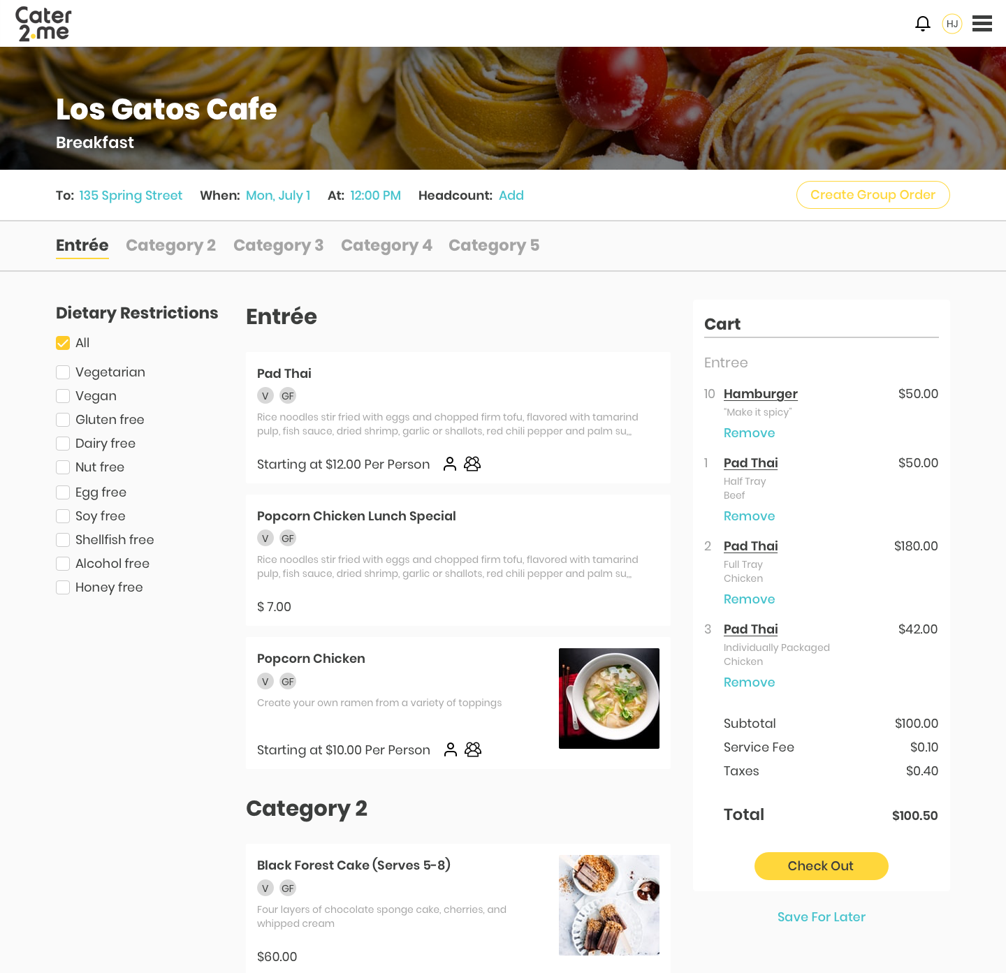
One pain point that was discovered was the item selection flow was "too complex". Item cards on our menu pages had deviated from the norm. Different variations of an item, e.g. "Pad Thai" & "Pad Thai Tray", were compressed into one card instead of each having a separate card.
Testing revealed the learning curve for this new schema was perhaps too steep. Users did not pay attention to the variation indicator icons on the card because they were used to separate items on other platforms. And once they opened the item modal, they were surprised and confused by a combination of tabs to separate family-style and individual portioned versions and a dropdown to select iterations within those two categories.
Compressed item card schema championed by a company founder

User testing found combining item variations made the customization modal difficult to grasp
This was an interesting dilemma as the system was only designed this way because a company founder championed it. He was adamant about reducing the number of choices on a menu to "let users quickly find what they want" and reduce the "friction for submitting an order."
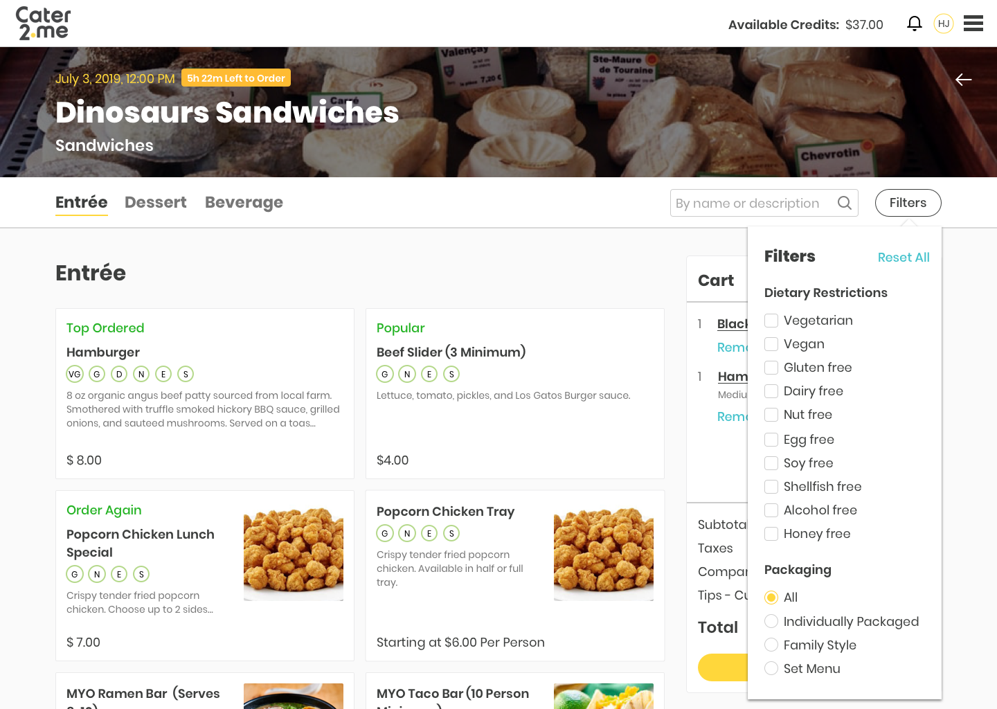
Fortunately, he was open to compromise once I presented our user test findings and explained we could accomplish his goal through other design features. We ended up separating family-style and individual portioned item variations, removing the need to show indicator icons on item cards and tabs on customization modals. The dropdown for iterations remained on the modal to still allow some items to be combined. Additionally, we decided to add search and filter functions to the page. This gave users the option to narrow down the amount of surfaced items without any additional learning curve.
Fortunately, he was open to compromise once I presented our user test findings and explained we could accomplish his goal through other design features. We ended up separating family-style and individual portioned item variations, removing the need to show indicator icons on item cards and tabs on customization modals. The dropdown for iterations remained on the modal to still allow some items to be combined. Additionally, we decided to add search and filter functions to the page. This gave users the option to narrow down the amount of surfaced items without any additional learning curve.
Revised menu page design
Overhauling Client Portal
The founder also saw the potential to increase user engagement through new features. He believed the new "Calendar" pages offered a far more compelling experience than the "Meal Feed" pages that traditionally played the central role. And we should "modernize" our site in one swoop to present a uniform experience. Thus he took charge of the product team personally around December 2019 and we began a full redesign of our portal.

"Meal Feed" page from the original portal

"Calendar" page on the new portal
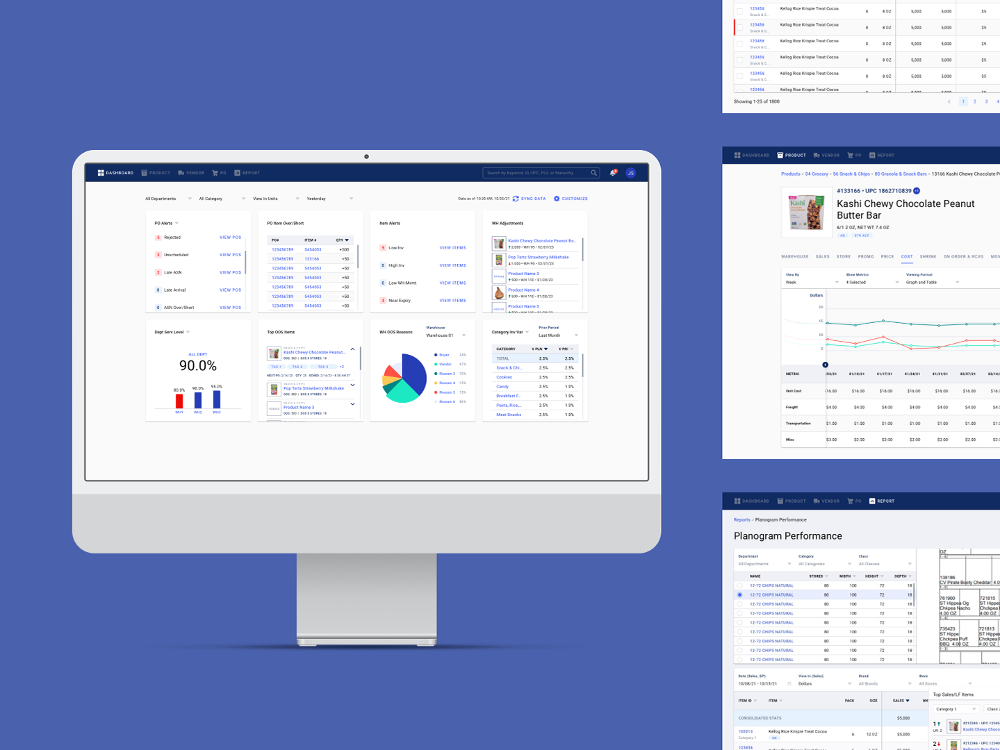
The focus now shifted to incorporating existing functionality into the new portal. One constraint was the founder wanted every single existing function to be replicated, so a user would not find any frequented function missing post-transition. For pages like "Account Settings" and "Billing and Payment", this was relatively simple. The redesign was essentially reorganizing the layout or structure to present a more clean and intuitive experience while utilizing the new design system.
Other more obscure pages, such as the "Proposals" page where users were able to quickly multi-confirm proposals from a list or the "Holiday Preferences" page where users could report schedule changes, were not so straightforward. To simplify the new portal, we wanted to trim pages such as these that had low usage traditionally, but the functions they performed had to be migrated to a fitting location. In this case, we tweaked the list view on the "Calendar" page to accommodate confirming proposals and added a special tag for holidays alongside a notification to prompt users to confirm their schedules.
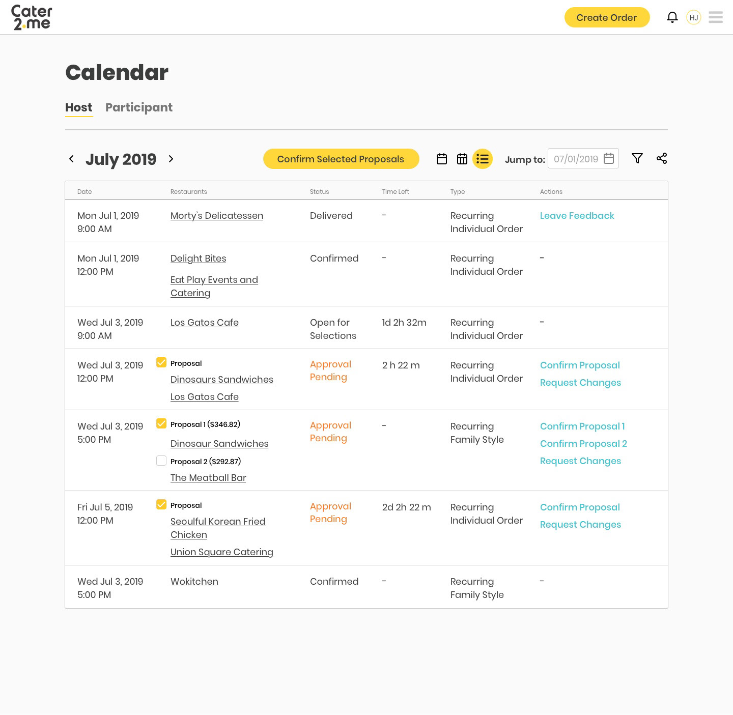
"List View" on the new portal

Holiday tags on the calendar
Adapting to Changing Business Environment
The final pivot before launch was caused by the COVID-19 pandemic. In late February 2020, our company suspected a nationwide lockdown was potentially incoming. This would virtually wipe out our core business overnight as offices close down. It was determined that we needed to prepare to implement individualized ordering in a residential setting and accelerate the deployment timeline from mid-year 2020 to April.
The engineering team immediately went into crunch mode devoting virtually all resources to this project. On the design side, I was tasked to quickly retool all corporate-specific designs to work in a residential setting, produce a signup and onboarding flow for residential users, and add a number of small tweaks on the fly based on requests from potential residential clients gathered by sales.
The engineering team immediately went into crunch mode devoting virtually all resources to this project. On the design side, I was tasked to quickly retool all corporate-specific designs to work in a residential setting, produce a signup and onboarding flow for residential users, and add a number of small tweaks on the fly based on requests from potential residential clients gathered by sales.

"Order Overview" page intended for corporate setting

"Order Overview" page redesigned for residential setting
Landing page and sign up for residential users
On-boarding flow for new users
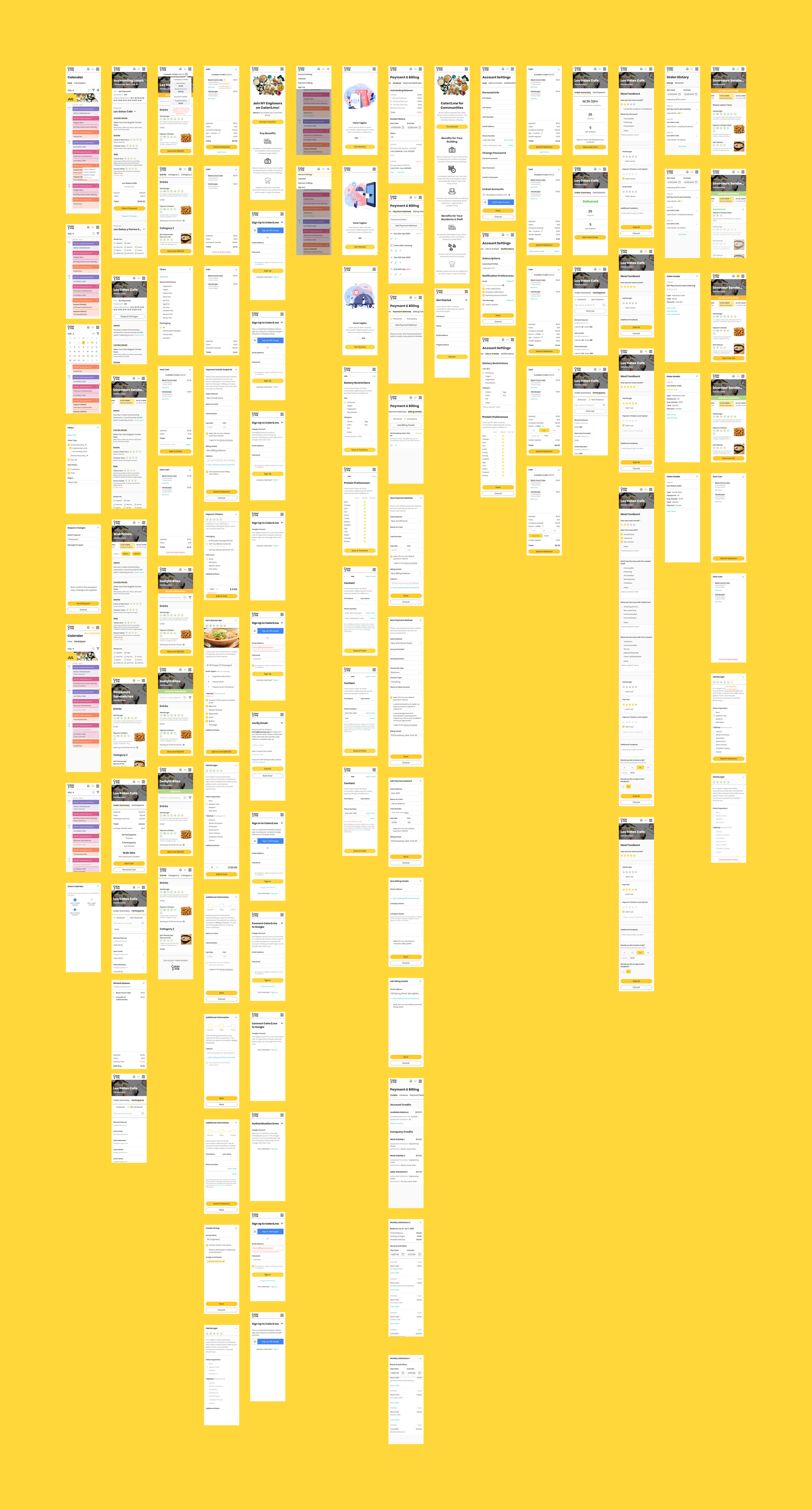
Launching MVP
Through the efforts of the whole team, we were able to launch an MVP version of the new portal in mid-April 2020. This version included over 100 screen designs/variations in total, focused solely on enabling regular one-off individualized orders and building subsidized orders.
In the first month post-launch, 38 residential buildings nationwide partnered with us to promote our service to their residents. These buildings had an average of 1000 residents each. We saw a ~20% first-week signup rate and an average of 30-40 orders daily during that period for each building. And for building subsidized event orders such as Cinco de Mayo, we saw up to 40% participation rate.
User reception to our new portal was positive. Building admins praised the experience as "intuitive" and "clean". And there were no reports of any major problems caused by user error or confusion.
We are continuing to iterate on the experience based on user feedback and the shifting business landscape. Small enhancements are released every two weeks. And a major update was implemented in June 2020 to enable the original planned corporate experience in preparation for a number of returning and new corporate clients. As of July 2020, revenue generated by individual ordering services has grown 13-fold when compared to the first month after launch.
Delivered Designs