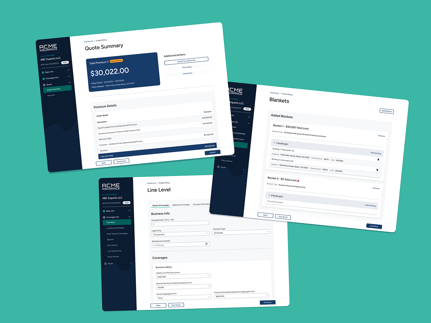
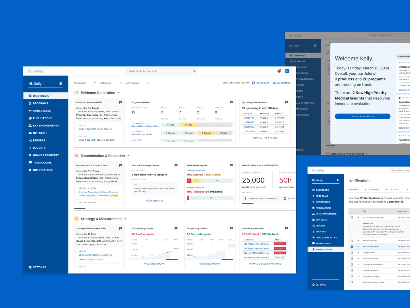
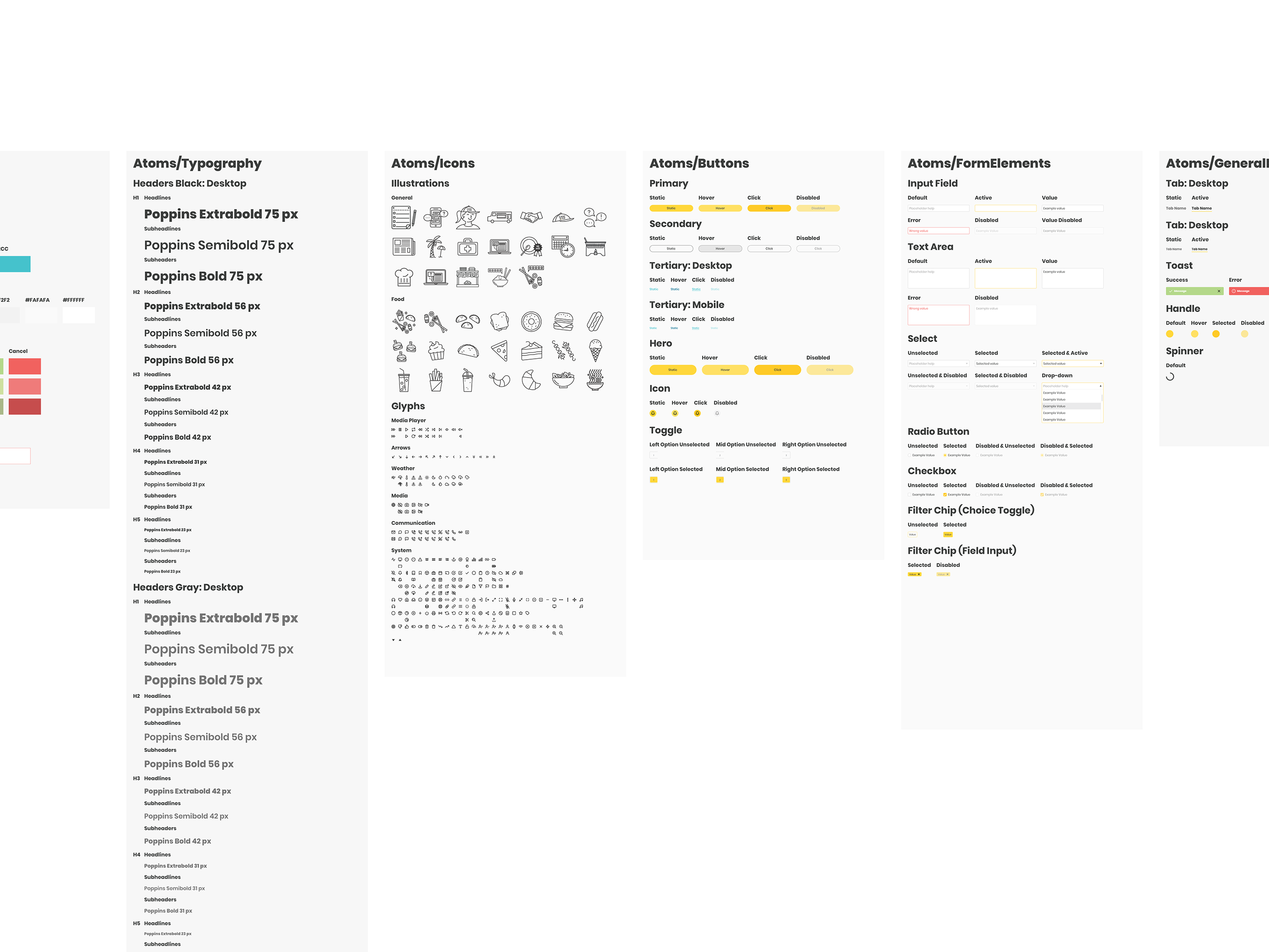
Overview
The main challenge I faced in making UX enhancements was that our existing in-house system had accumulated many design/tech debts since its inception almost 8 years ago.
Many pages were clunky or overwhelming because new things were constantly added without consideration for user experience as a whole, while obsolete features were never removed. Stakeholders were often resistant to any change because "people are already used to it" or "something might break". At the same time, engineering resources were limited as client-facing pages and bugs would have priority.
What I found working well was proposing a few additional changes each time when work was already planned to be done on a page. These additional changes would be focused on addressing only the most glaring issues. And they were often backed by research identifying pain points that would naturally surface during user interview/testing for the scheduled task. Stakeholders are much more receptive to this piecemeal approach backed by employee feedback than a drastic overhaul.
The last thing was to be always open to compromises. Stakeholders would often have information not available to designers, bringing forth unexpected concerns or constraints. It was always better to get some improvements for the users now than waiting for a chance that may never come to implement the most optimal changes.
The last thing was to be always open to compromises. Stakeholders would often have information not available to designers, bringing forth unexpected concerns or constraints. It was always better to get some improvements for the users now than waiting for a chance that may never come to implement the most optimal changes.
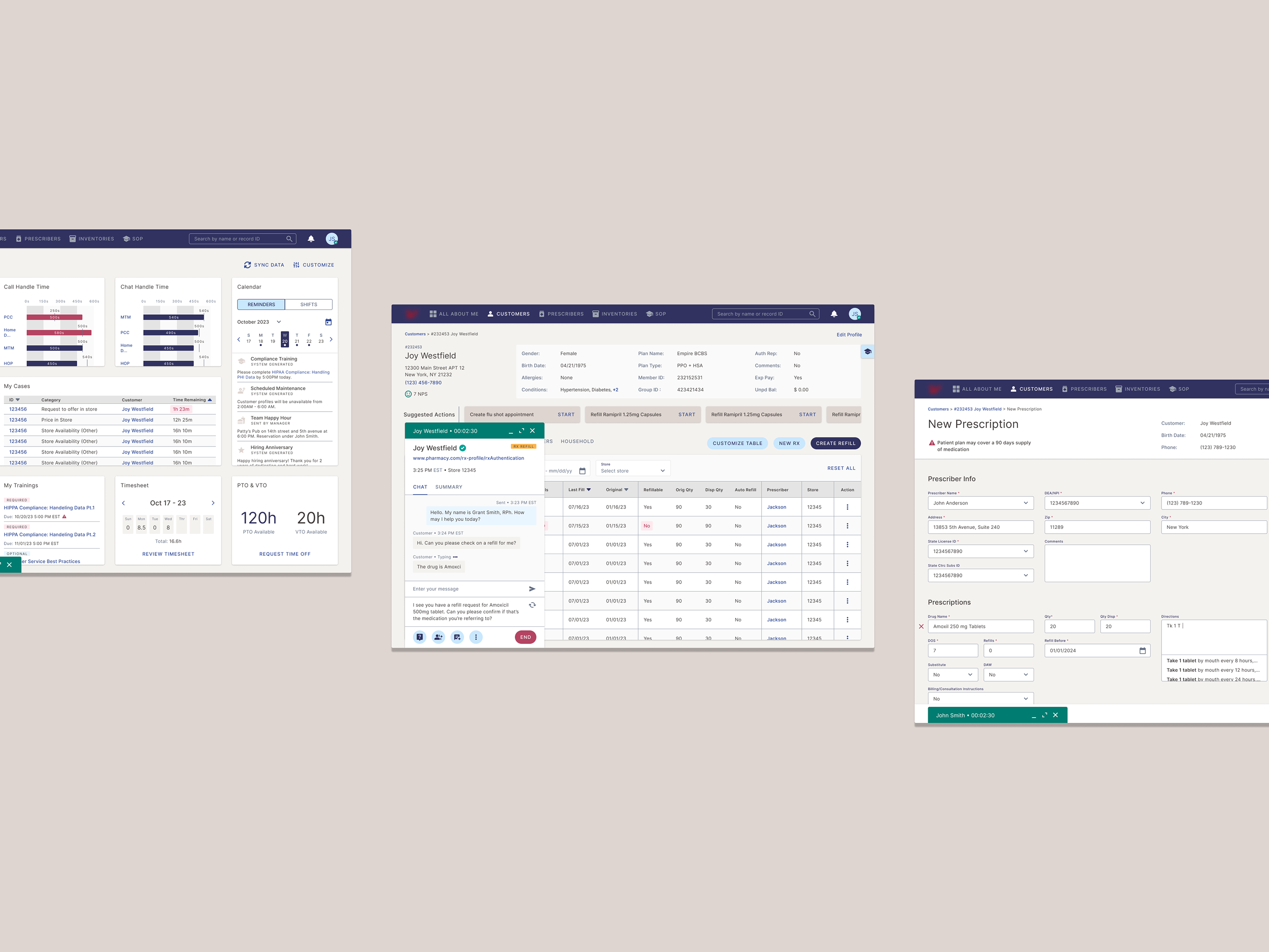
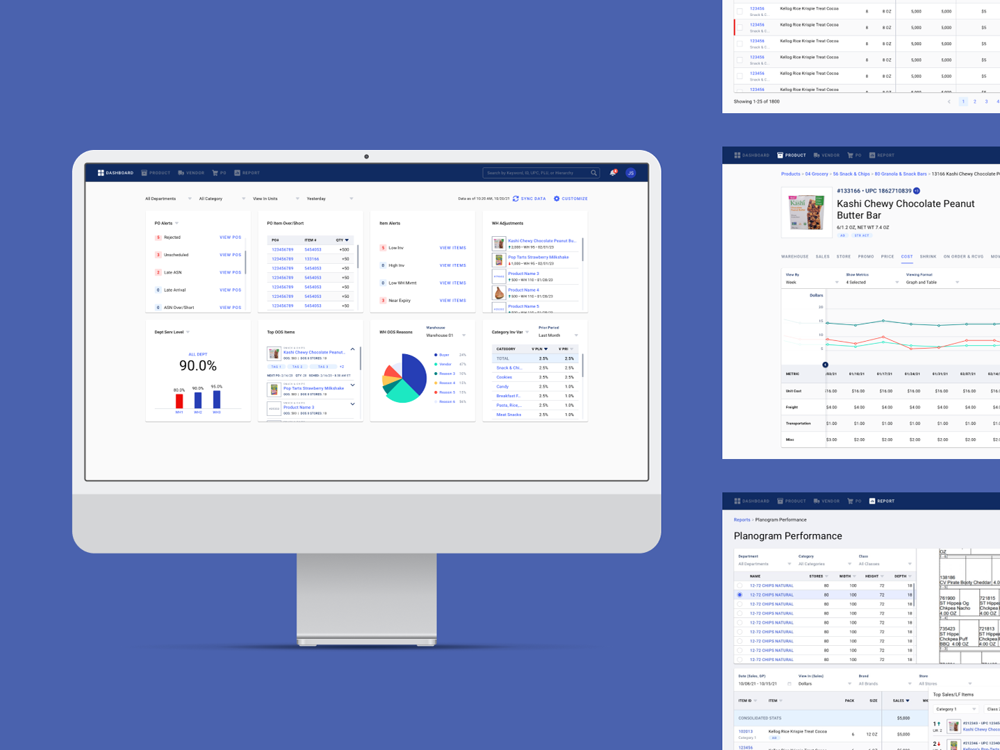
Sample Case - Order List Revamp
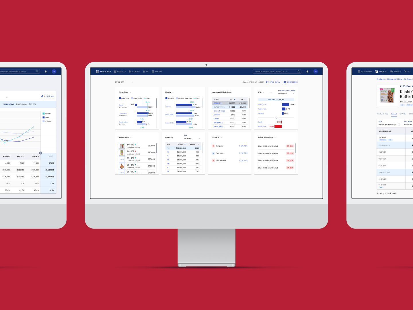
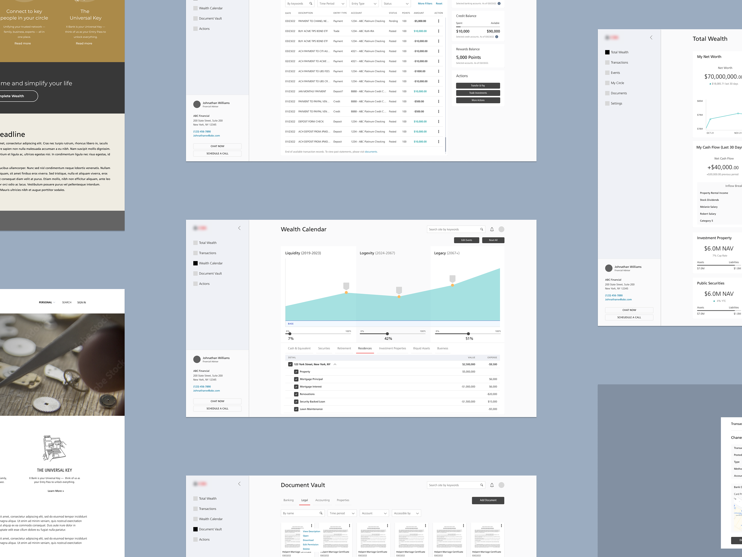
My original task was to add a number of new filters to the 'Order List' page (see below). As part of my initial research, I interviewed a number of account managers about their past experiences using the page. They were asked to walk me through a few commonly performed tasks while speaking out loud their thoughts.
A few pain points consistently appeared across the interviews. The first was the filter fields were taking up too much screen space. This forced the user to scroll down each time to get to the table, which was the most important content.
At the same time, I observed users often had to clear an applied filter to see what the filter was. Labels for filters have been previously removed and turned into helper text inside the fields in an attempt to reduce the amount of space used. But this did not take into account that users often utilized saved filter lists, opening the page with filters already applied.
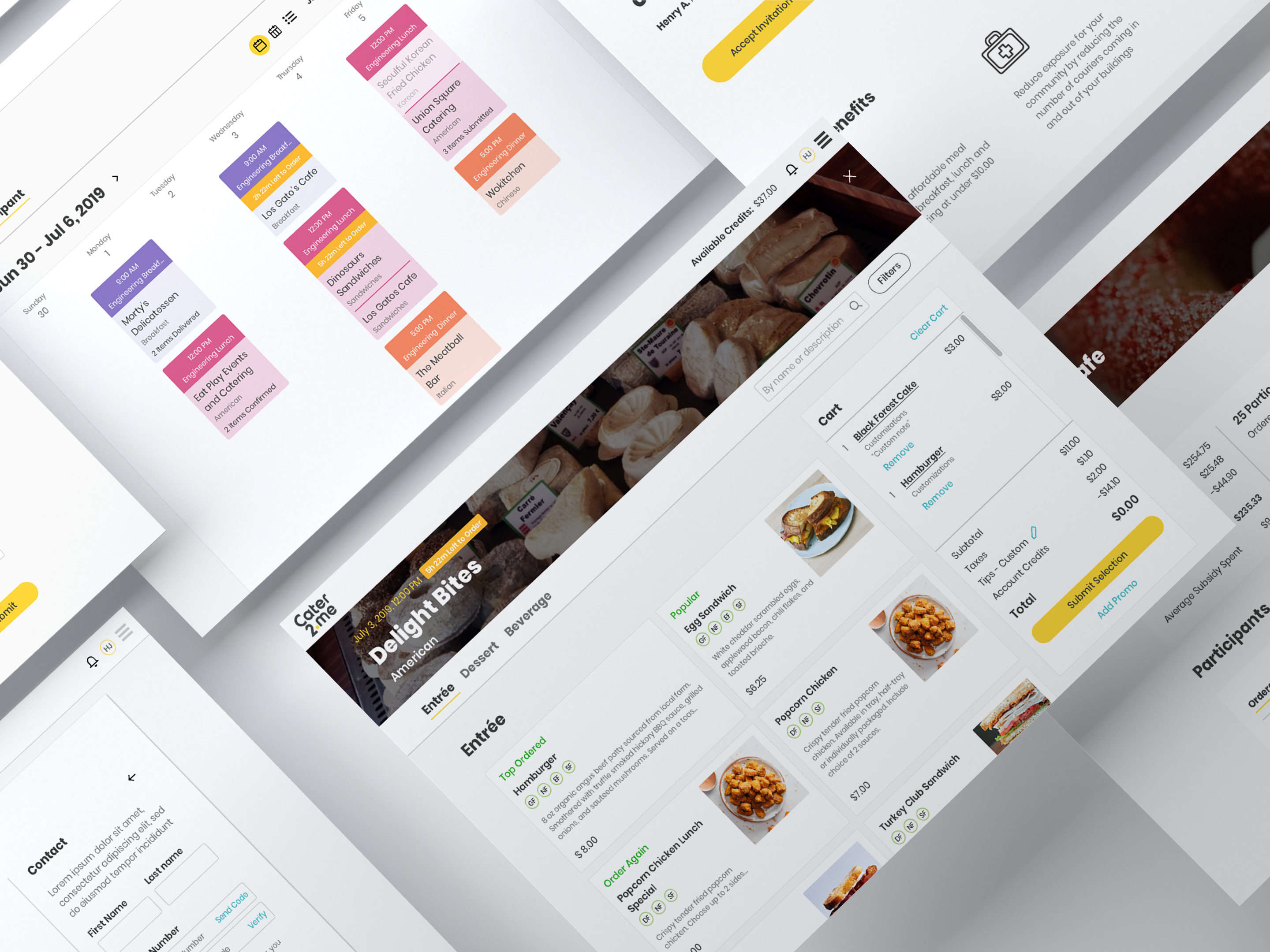
The SMS window was another pain point. It was "super confusing" when multiple conversations were selected for display. In this case, the conversations were all displayed in the same window without a way to clearly distinguish between them. This feature was simply added on top of a window originally designed for a single conversation without considering how it altered the experience.
At the same time, I observed users often had to clear an applied filter to see what the filter was. Labels for filters have been previously removed and turned into helper text inside the fields in an attempt to reduce the amount of space used. But this did not take into account that users often utilized saved filter lists, opening the page with filters already applied.
The SMS window was another pain point. It was "super confusing" when multiple conversations were selected for display. In this case, the conversations were all displayed in the same window without a way to clearly distinguish between them. This feature was simply added on top of a window originally designed for a single conversation without considering how it altered the experience.

I proposed several changes that addressed these pain points in addition to the original task.
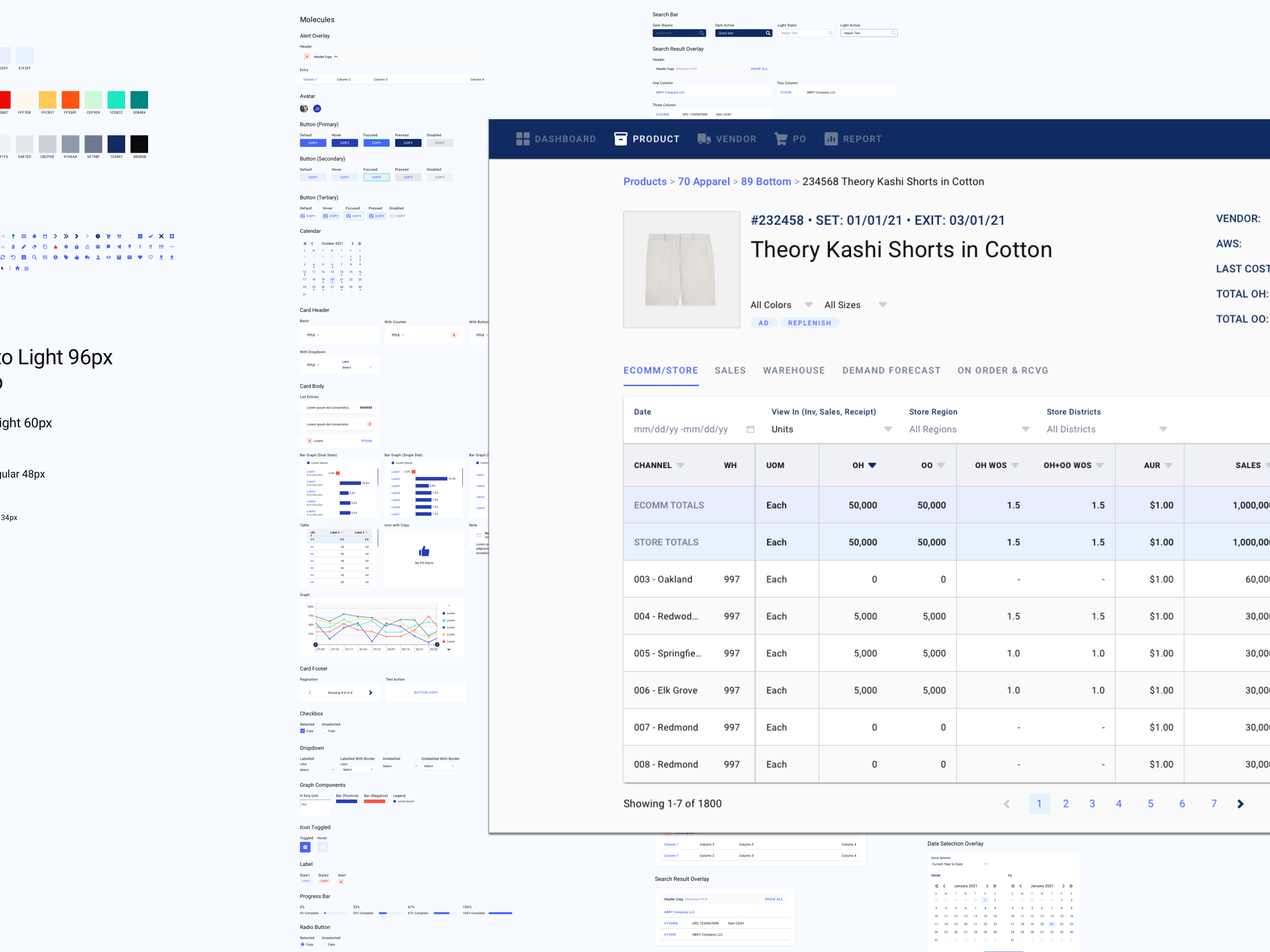
The first was to move the filters to a collapsible sidebar reducing screen space usage. Initially, I also pushed to remove some rarely used filters. However, a stakeholder was concerned that removing them run a technical risk of breaking the saved filter lists.
We eventually reached a compromise of adding a feature to hide unselected filters by default when using a saved filter list. Combined with grouping similar filters, we were able to reduce a user's cognitive load while minimizing the impact of adding new filters in the future.
For the SMS window, selecting a participant would now open up a new conversation window similar to Google Chat. This let the account manager easily distinguish between conversations. It was very well received by the stakeholders as they already identified account managers missing incoming messages as an issue. They even proposed a notification to be added on the windows alongside auto-opening to further reinforce the visibility of new messages.
In the end, striking a balance between UX needs and stakeholder concerns while backing up designs with user research was the key to obtaining approval for a proposal to move forward.