As the sole UI/UX designer, I worked alongside a Product Manager, a Creative Director, and key client stakeholders to design a new Enterprise Resource Planning (ERP) portal envisioned to be the cornerstone of their evolving back-office operations.
To tackle this, we categorized the screens based on modern UI analogs, such as Tables or Forms. We then determined where they might fit in our information architecture (IA) by classifying them as top-level dashboard screens, mid-level list screens, or bottom-level detail screens. This assessment deepened our understanding of the existing process and guided us in selecting appropriate UI patterns to create a unified experience that current users can easily adapt to.
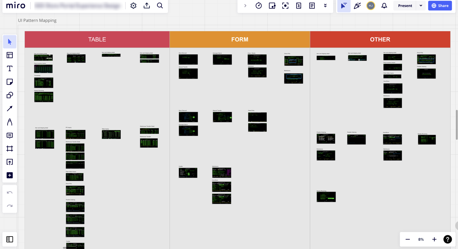
UI pattern mapping exercise for command line style screens
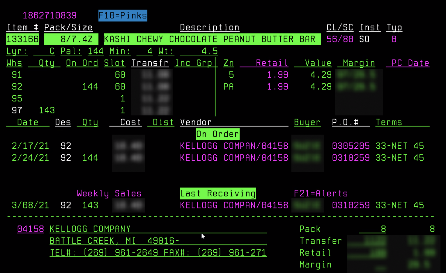
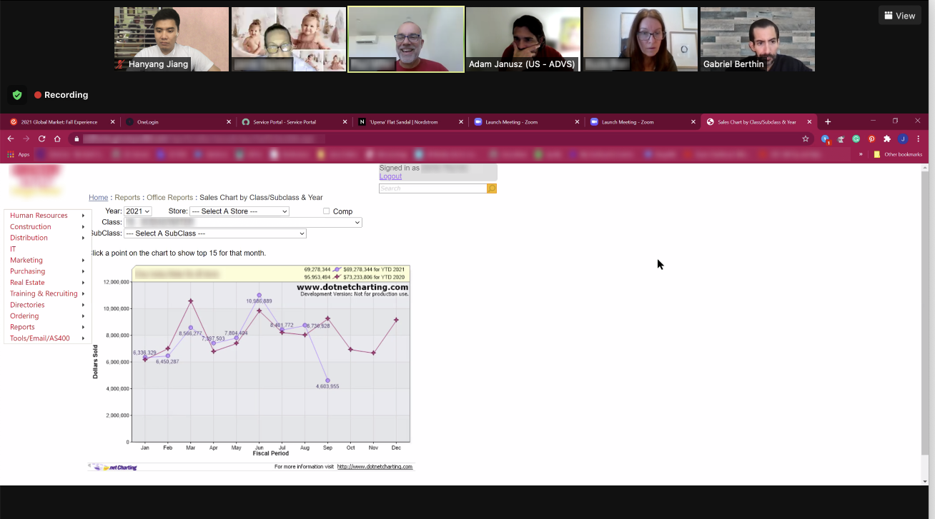
Current AS400 system screen
Redesigned UI for the same screen
Summary of project requirements
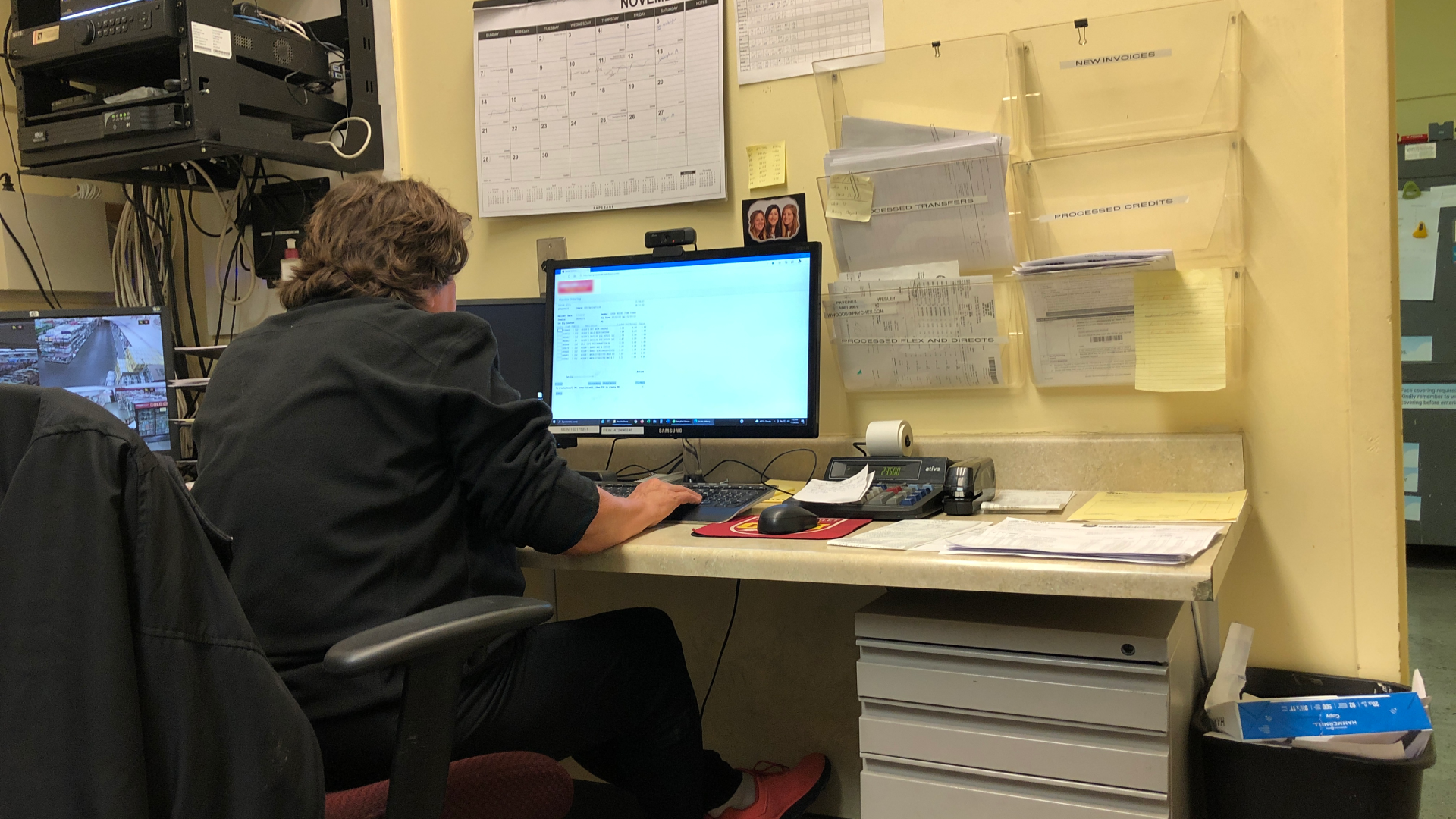
Observing how a user interacts with the system in a real environment
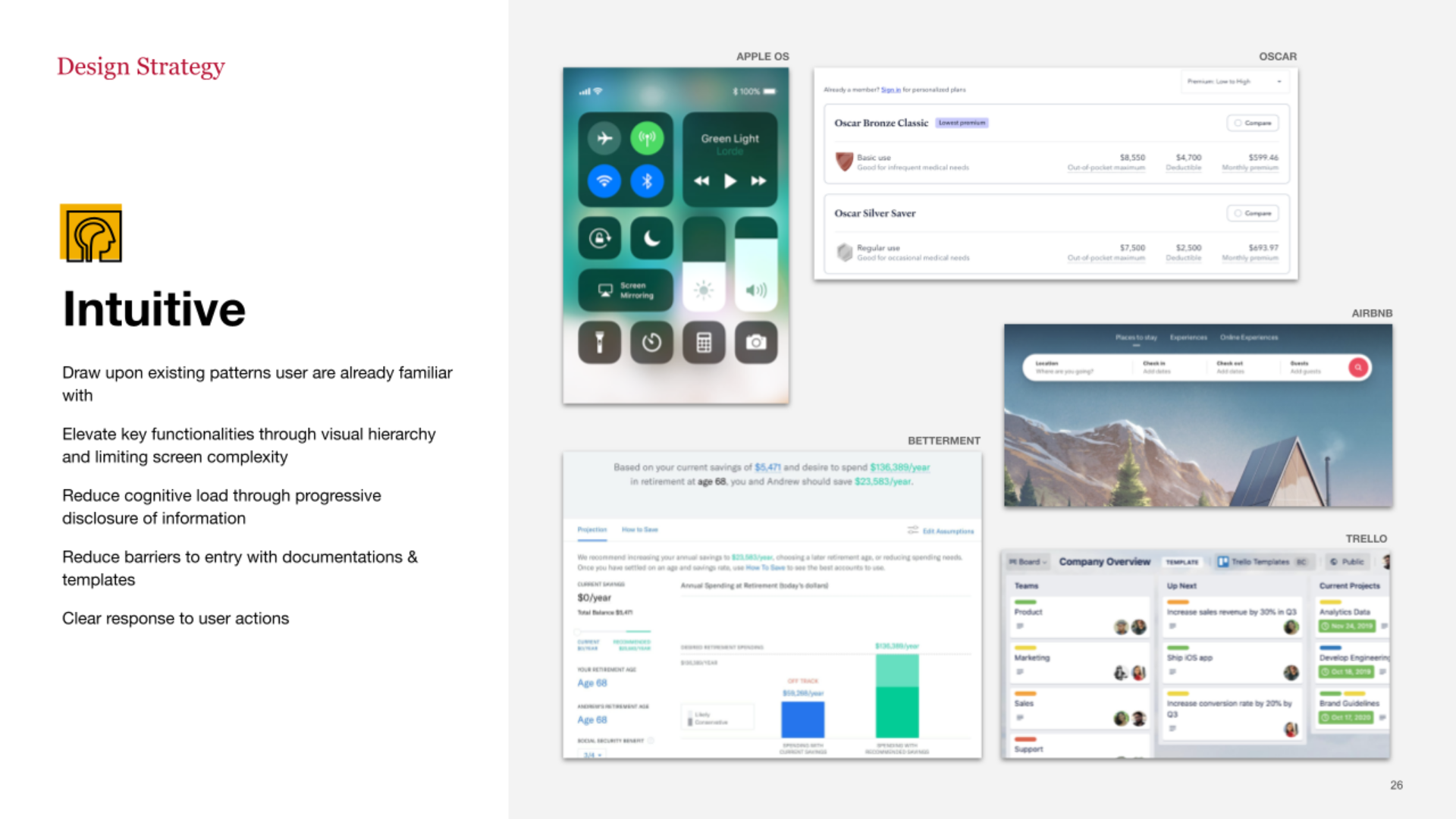
Example of a design principle

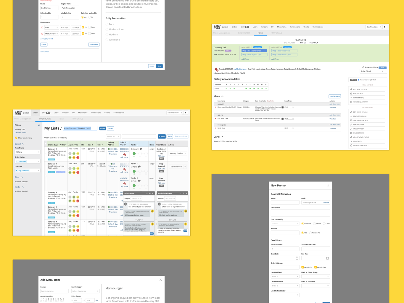
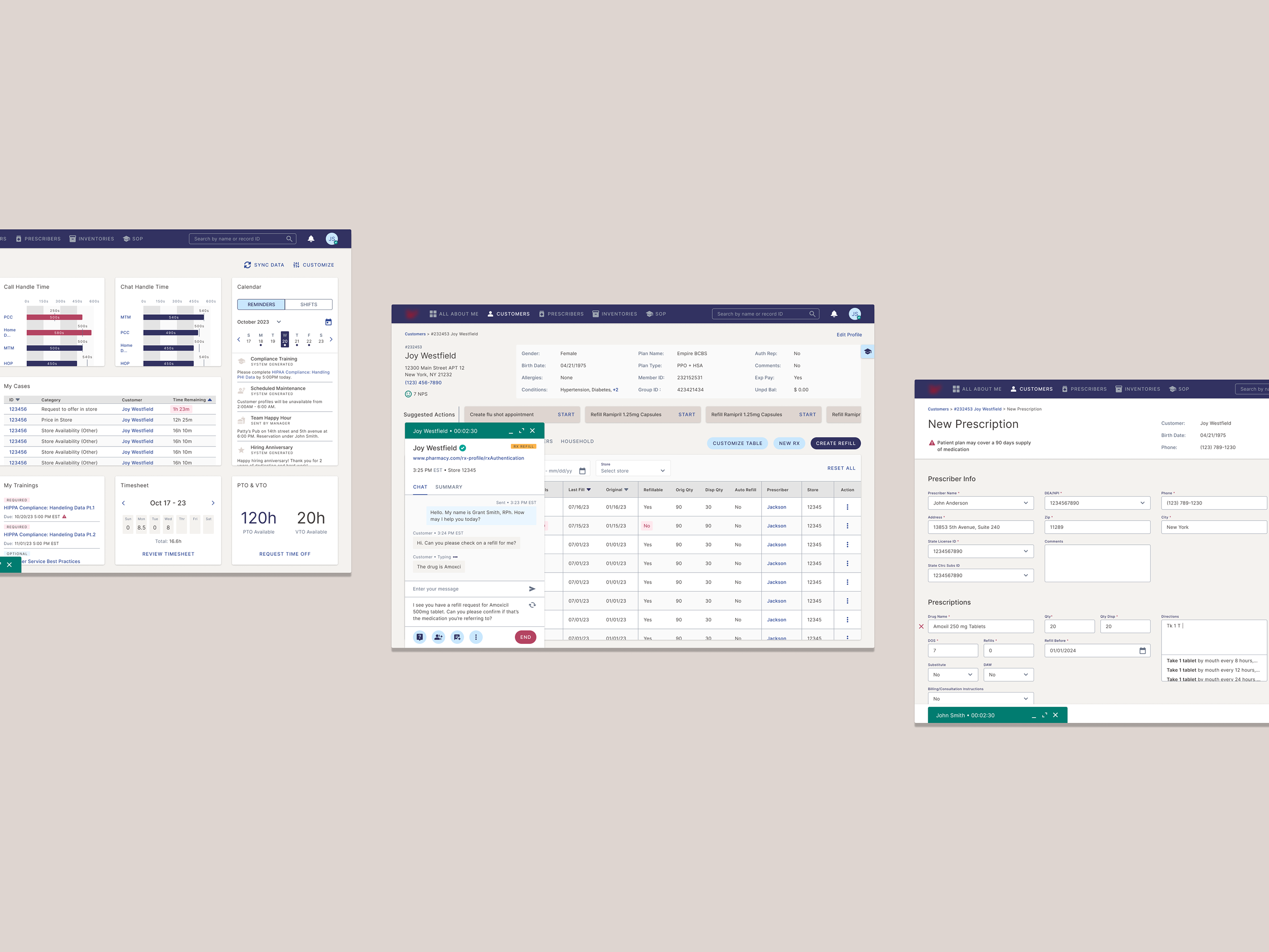
Proposed wireframes and flows alongside IA

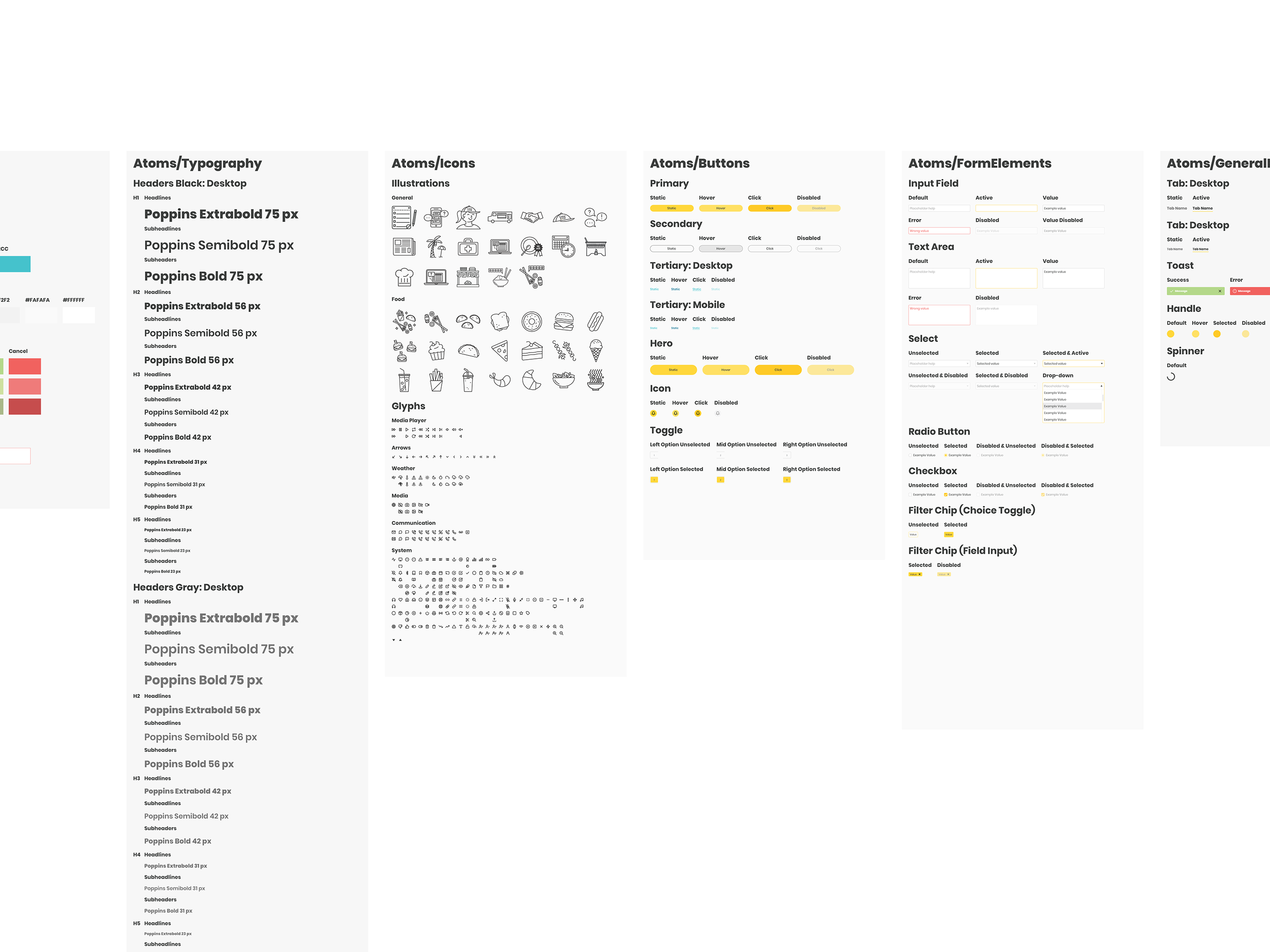
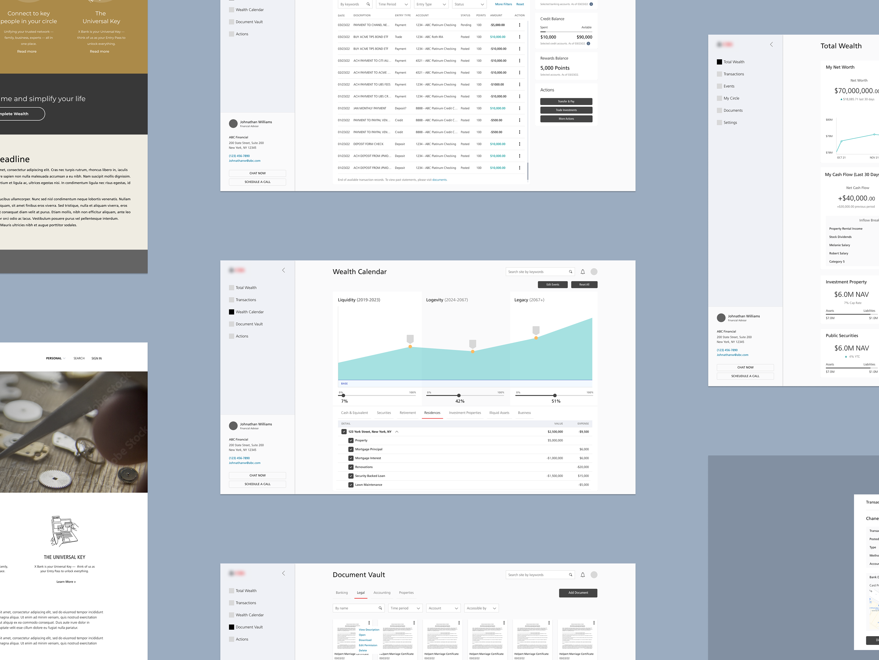
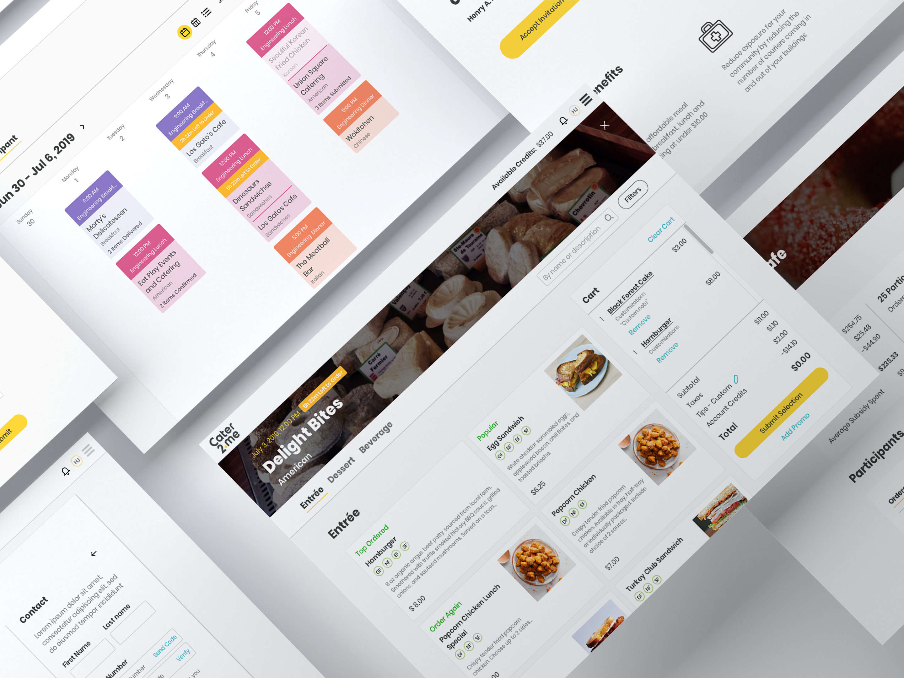
Visual direction concepts
A General Merchandise Buyer looking at trends for a longer time period due to the need to plan for import and delivery
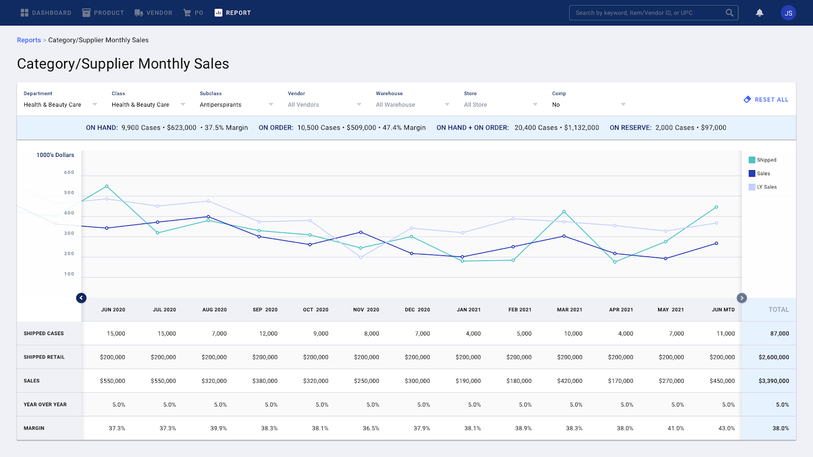
Sales Report with the ability to modify time increment to accommodate different user types
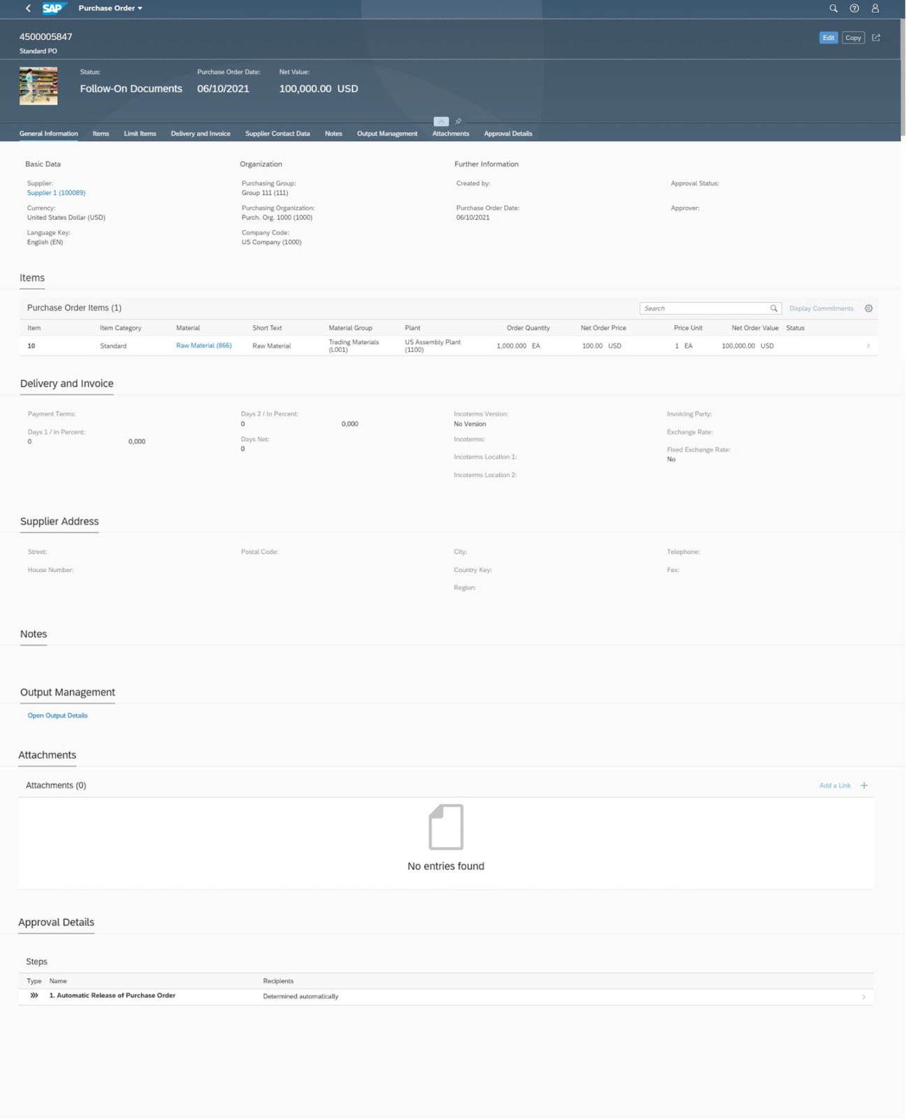
SAP PO form
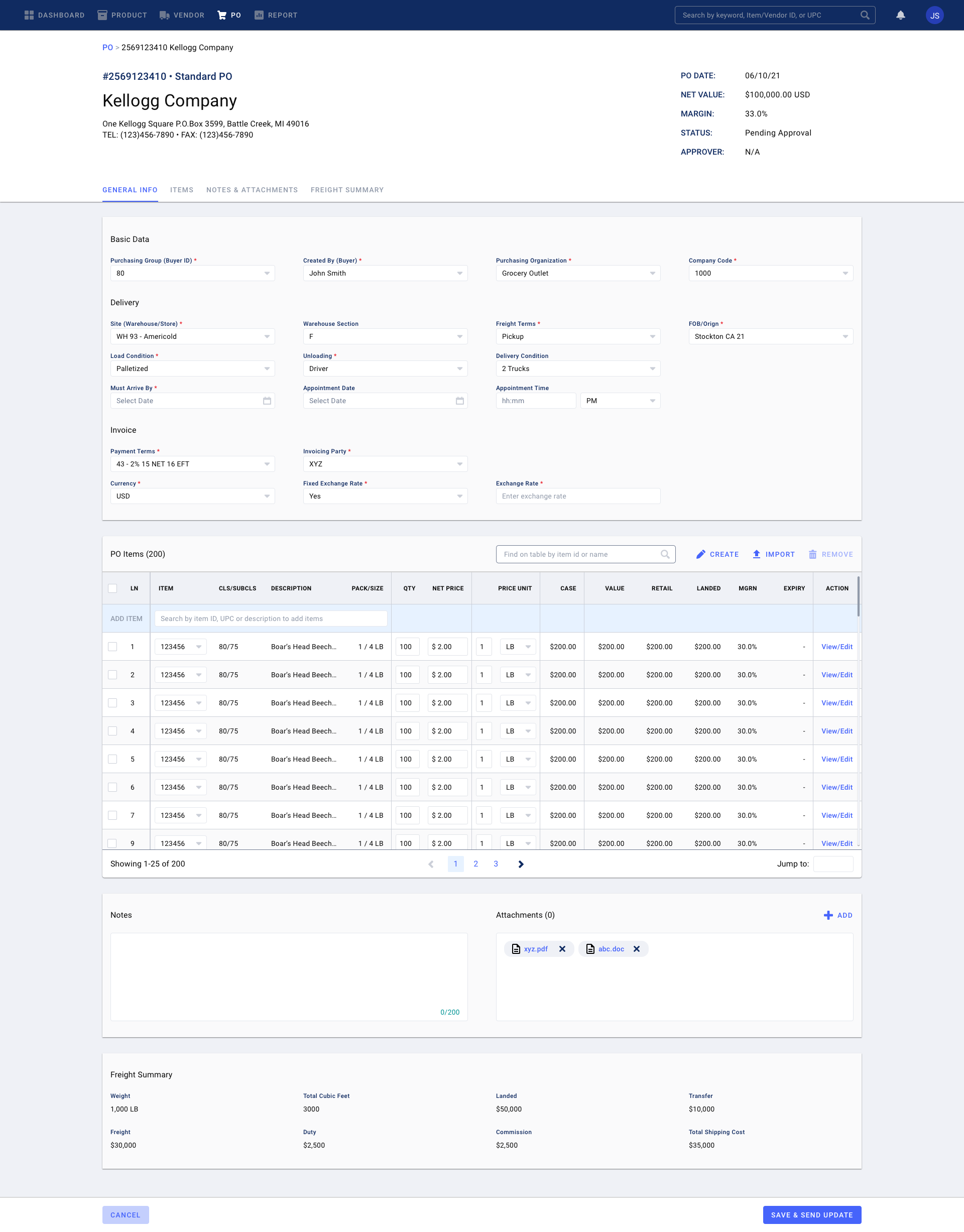
Portal PO form
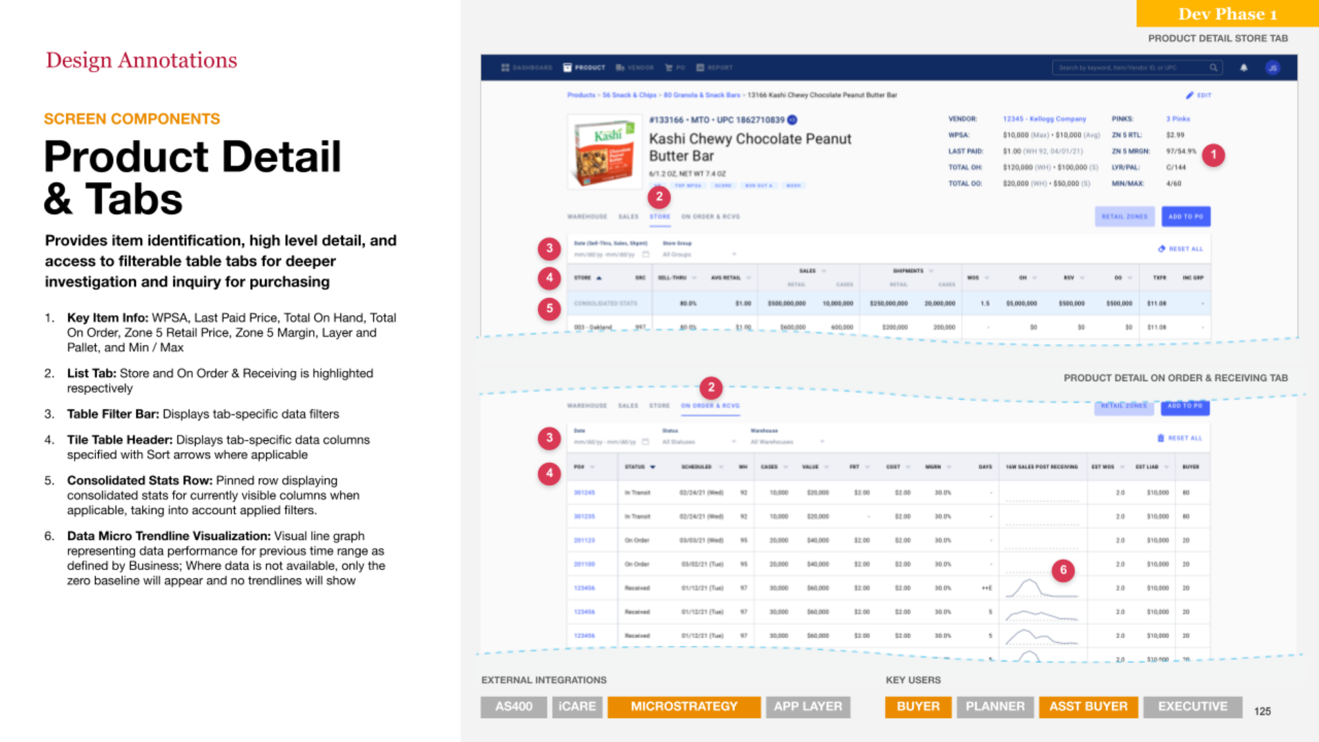
UI documentation example
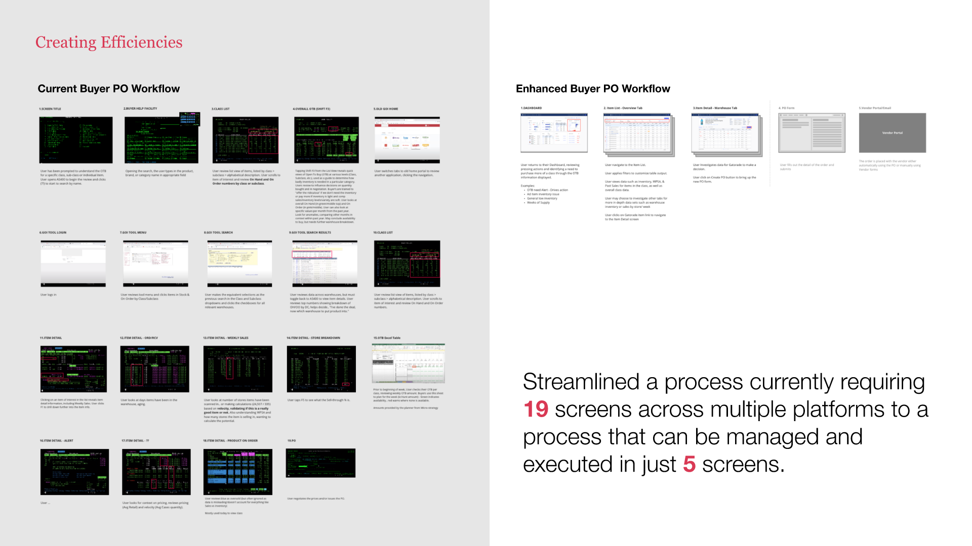
Example of our impact highlighted at the final presentation

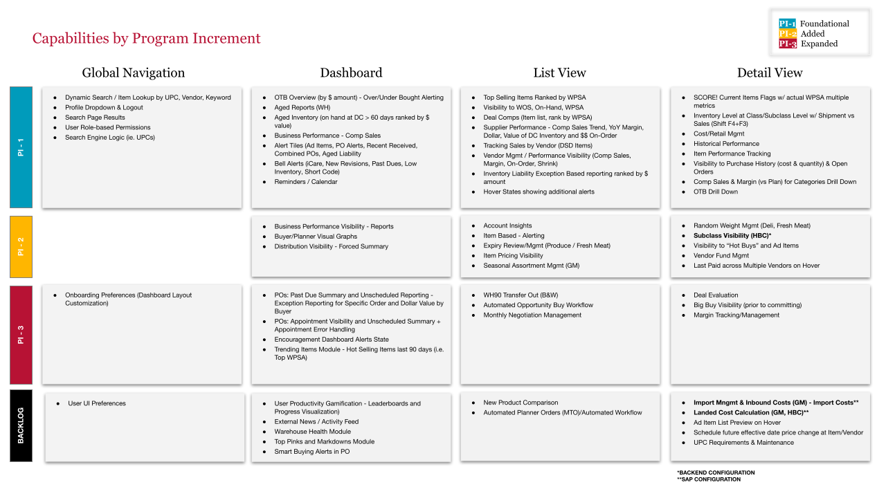
Final Information Architecture

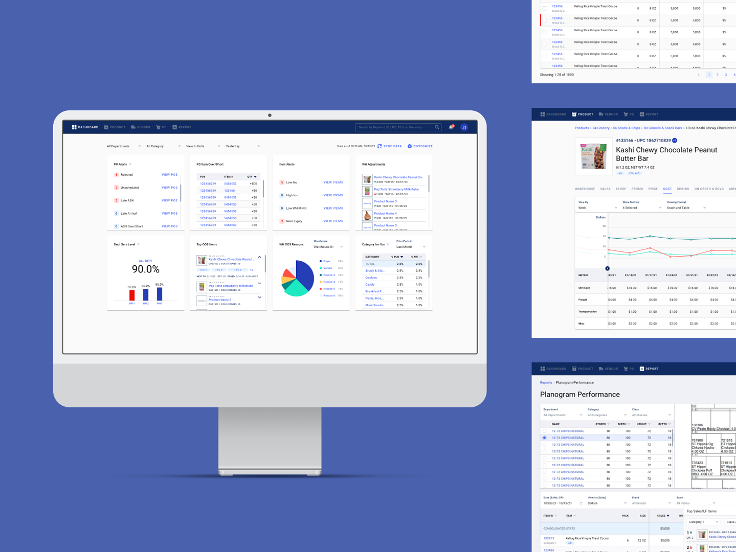
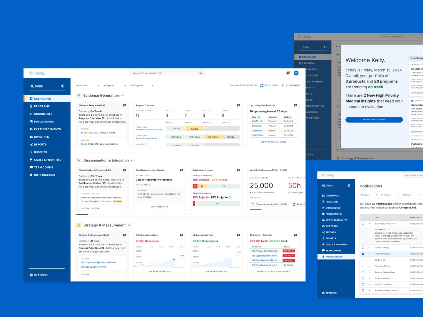
Final Dashboard designs
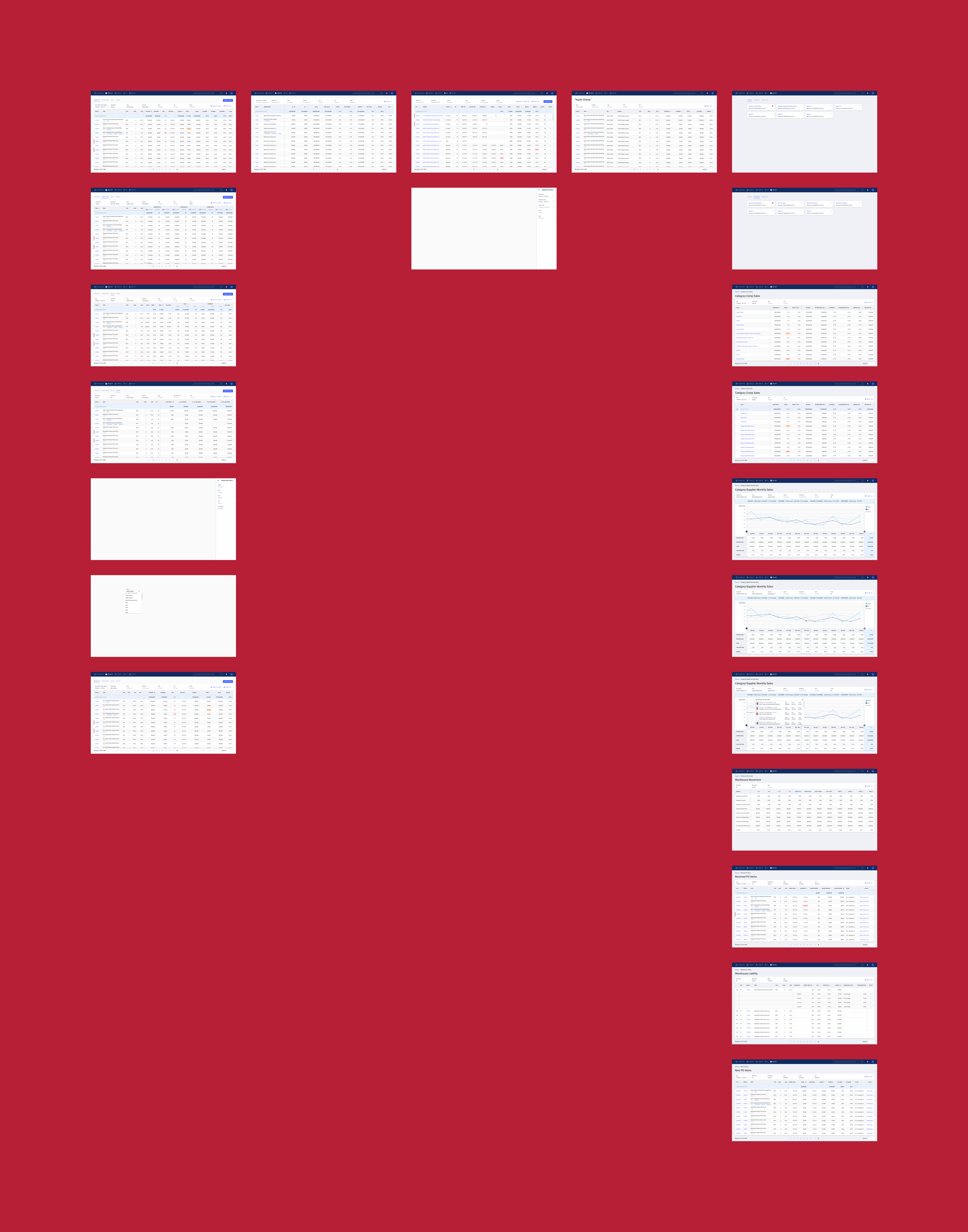
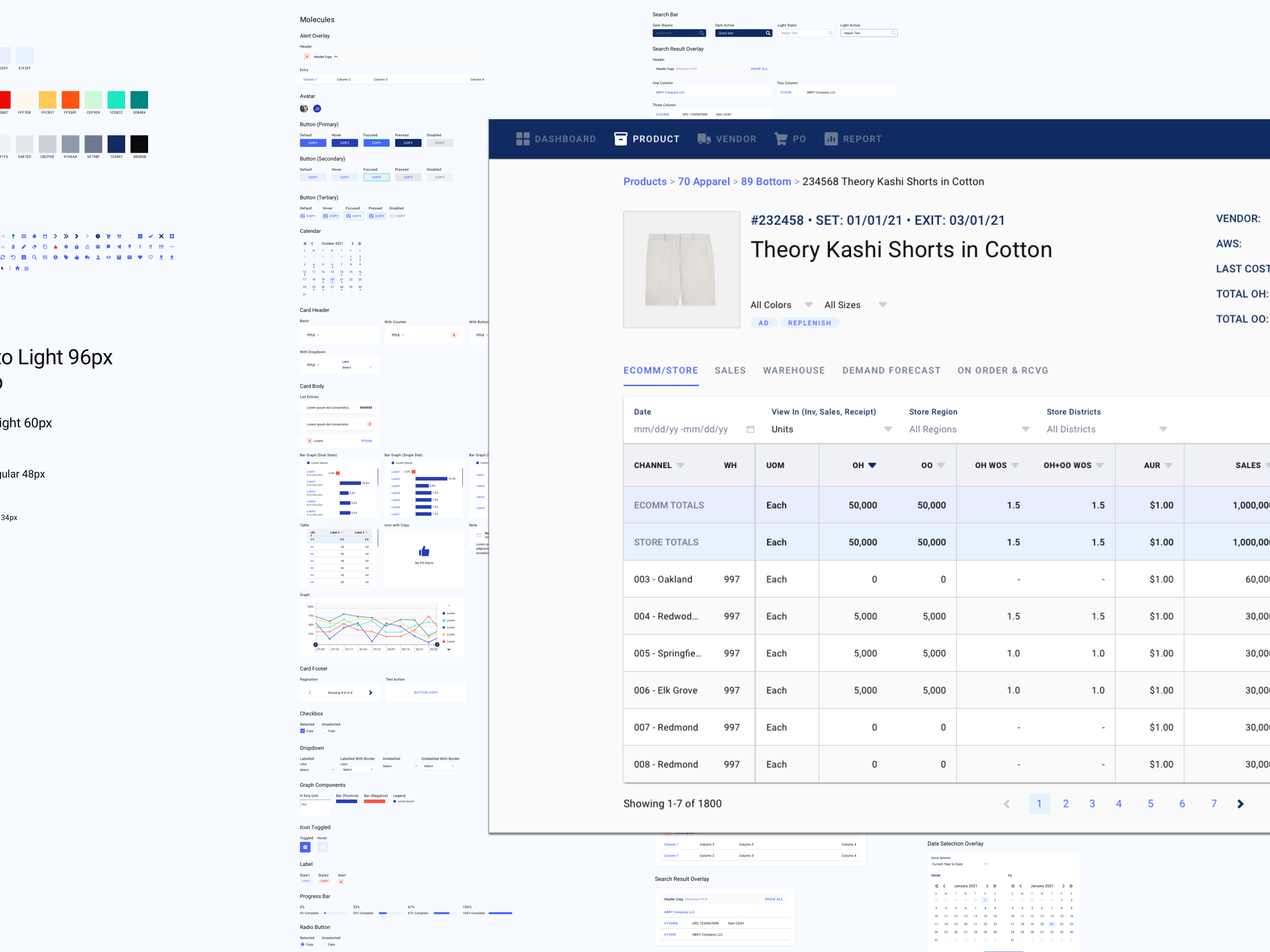
Final List and Report View designs
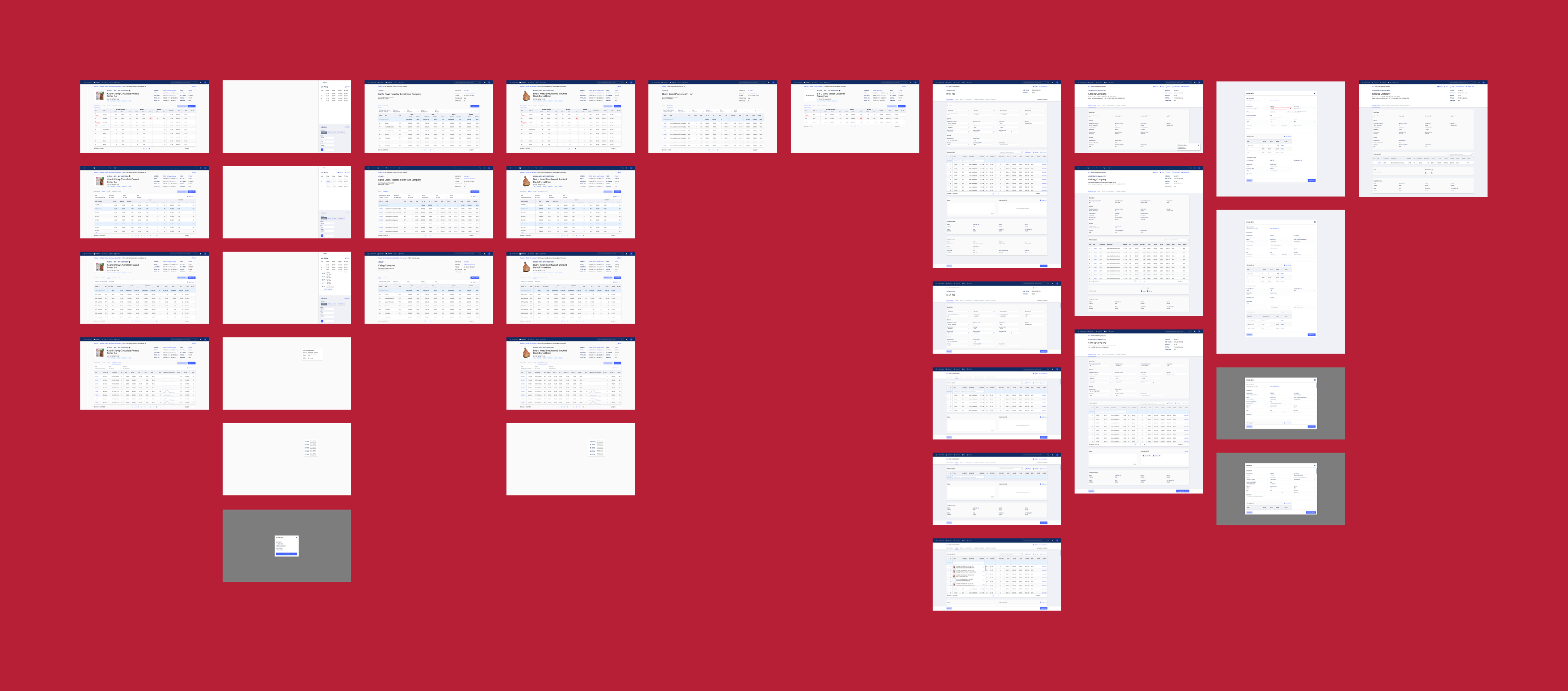
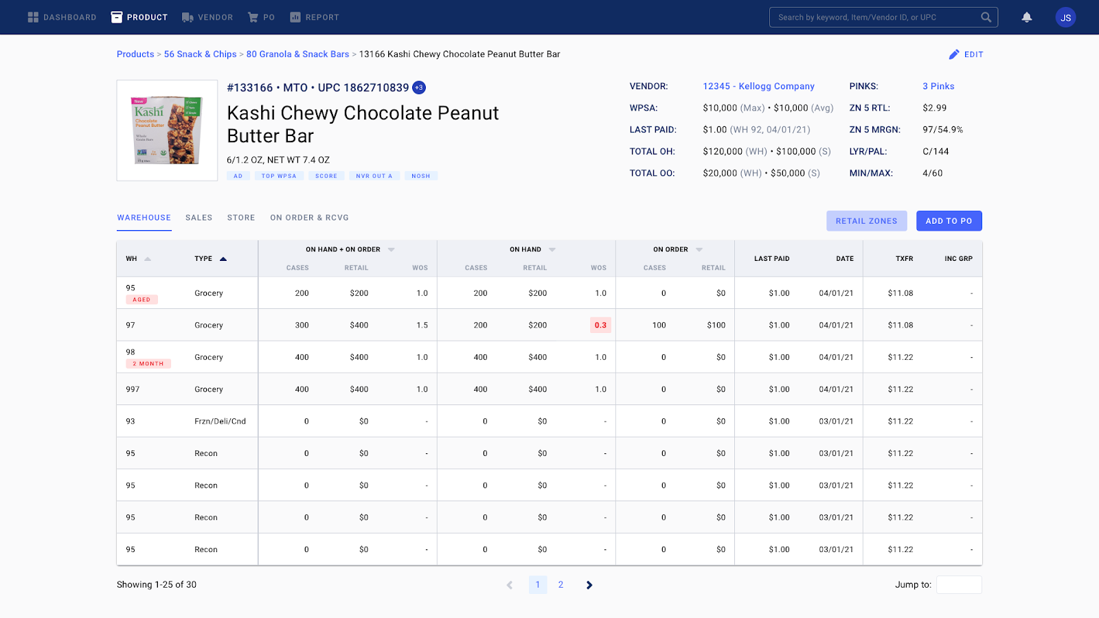
Final Item, Vendor, and PO Detail designs